01. Audit
Before I started a new system, I audited and documented appsumo.com and all its buttons, dropdown, text field, text styles, patterns, emails, etc.
02. Acceptance criteria
- Must follow W3C AA guidelines.
- Define new branding standards, including colors, logos, illustrations, graphics, typography.
- Design new components from scratch.
- Create easy-to-use library in Figma
- Build Nuxt components.
03. Design & brand refresh
Dorado is a product that’s continuously being worked on, from a brand viewpoint, components, and development in code.
Branding
I partnered with our marketing designers and content team for a brand refresh. What is our voice? How many logo color variations do we allow? How do we build a system around all our divisions?
Figma library
I created three libraries: logos/branding, illustrations and graphics, design system components. This allowed all creators, including email designers or social media coordinators to build their own headers and backgrounds.
Nuxt for engineers
Due to resources, a contractor developer was hired to build components in Nuxt.


04. Implementation
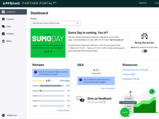
Dorado is continually being iterated based on if components work in real-life designs on our .com, the partner portal, emails, etc.