1. Problem
The traveler app (GladPro) UI was dated and the experience was inconsistent with the HomeAway traveler app experience. Info was hard to find and not promoted based on where the guest was within the stay.

2. Plan
Along with bringing the existing HomeAway Mobile Hospitality (MHM) product experience to this app:
- Unified traveler experience
- Improved adoption by guests
- Sales demos will have more impact.
- Improved device compatibility (moving to Xamarin) and feature support
3. User flow
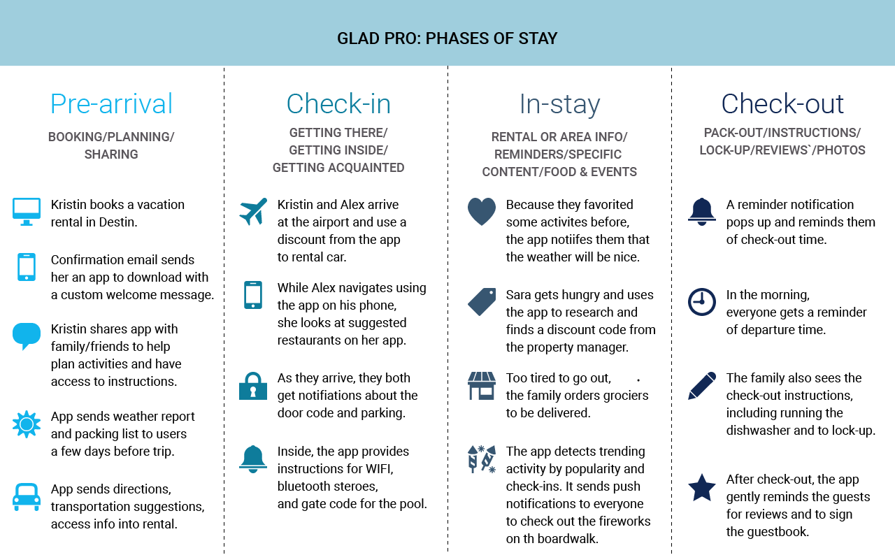
The app’s flow revolves around traveler “phases of stay,” which helped better manage content items:
- Pre-arrival
- Check-in/arrival
- In-stay
- Check-out/post-stay
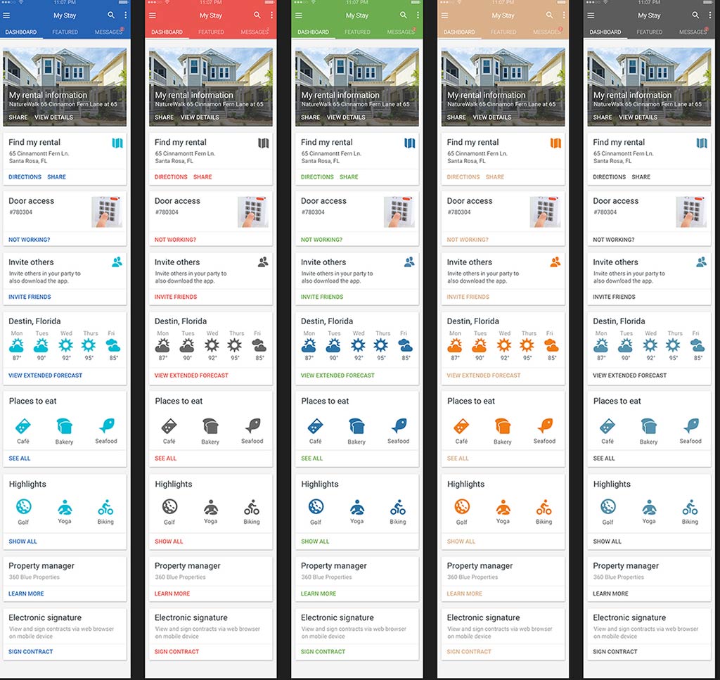
Based on the priority (0-10) and phase, the app will reorder content cards (system or user-defined) to ensure that the most pertinent information is displayed on the “My Stay” dashboard.
4. Design
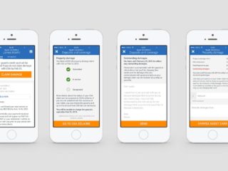
I picked up this project from another designer, and re-designed the initial screens to provide better visual hierarchy and finished the rest of the project. I also switched to as many SVG icon assets instead of images (within the cards) for easier dev building and load time.
GTHY Pro is customized for each property management company, but because there are so many companies, we couldn’t customize each app’s branding (as seen above in the old screens) every single time. Instead, they can choose from five color schemes:
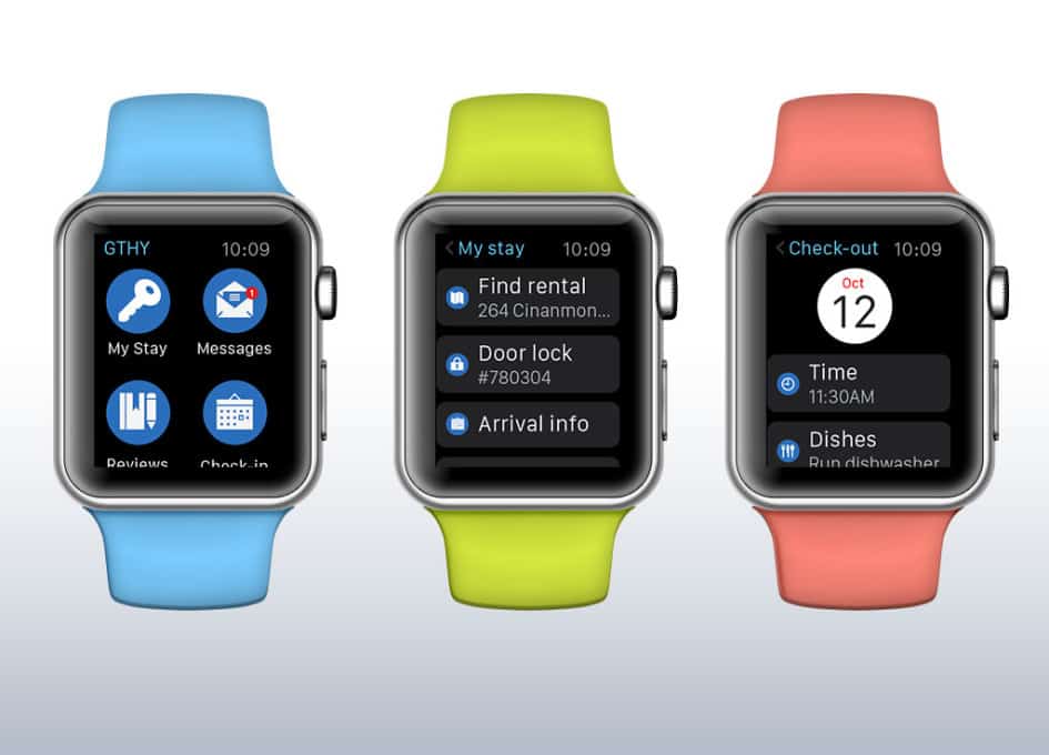
We also designed and built a simple iWatch app (the first version iOS), which was an interesting project due to the constraints of space and technology.
