1. Problem
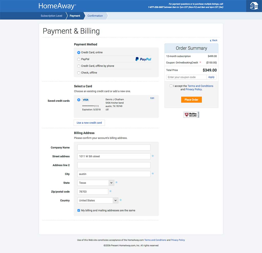
The old HomeAway subscription cart was functional, clean, and easy to use, but it wasn’t responsive and didn’t fall into the HomeAway 3.0 design and product strategy. Moving forward, the company would no longer sell tiers and instead,
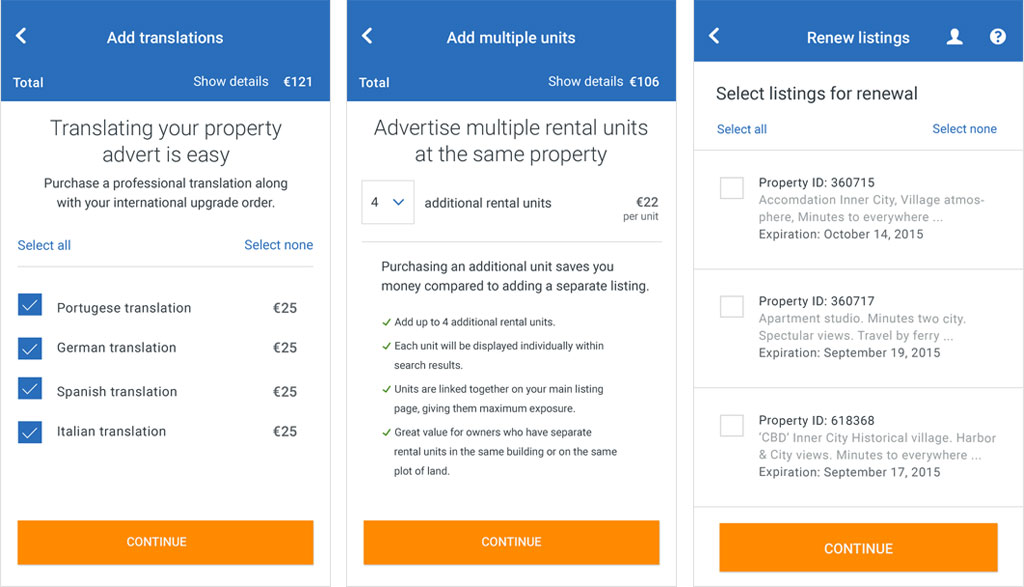
simplify product offerings. Re-designing the cart meant planning one for new members, and for existing members looking to upgrade or renew.

2. Wireframes
Mobile-first always!
3. Design
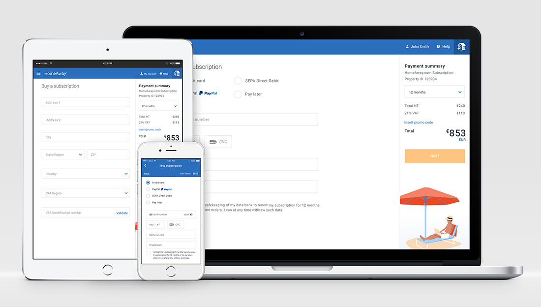
When designing responsively—especially in the days before the “mobile first” strategy– the instinct is to hide elements to fit everything into a tiny display. Since the cart elements and requirements were already pared down, I had no excuse to hide things. The payment summary was probably the biggest concern since it could run long, depending on the country or what you were buying.


