1. Problem
Editing settings, running a simulation, and viewing results all lived on the same screen. Users could change a parameter mid-run, see results from a previous run rendered against their current inputs, and have no way to tell which settings produced which outputs. There was also no true landing page — past simulations were buried in a table under the Simulations tab.


2. Discovery & user research
The most valuable signal was already inside the company. First, internal employees struggled which made it hard to train users. Sales didn’t understand it enough to sell the product. I shadowed Customer Success on training calls and pulled patterns from their support notes:
- “Which settings made this chart?” was the most common question in trainings. Users couldn’t trust results because the inputs on screen weren’t necessarily the inputs that generated them.
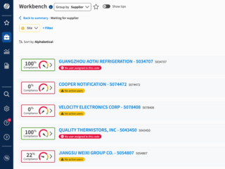
- Customers rarely revisited prior simulations — not because they didn’t want to, but because they couldn’t find them.
- One of our highest-volume users told a CSM they’d delayed adoption for months because v1 felt overwhelming.
Three core problems appeared: mode collapse (editing/running/viewing weren’t separated), no home base, and a vocabulary mismatch — “simulations” read as a technical artifact; users thought in terms of scenarios.


")
3. Design
I rebuilt the IA around a clear separation of states, working in Figma against my design system and prototyping in Firebase to pressure-test ideas quickly as the my product manager and iterated.
Navigation moved from a left sidebar to a top bar. The vertical rail consumed space it didn’t need and was frequently overlooked in testing. A horizontal top nav reclaimed the canvas and put wayfinding where users actually scanned.
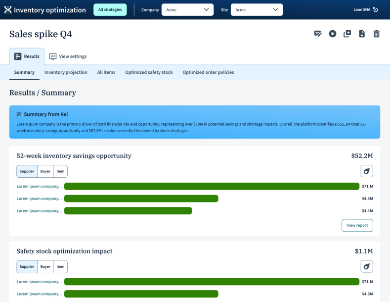
A real landing page: “All strategies.” Every scenario that has been run has a place and a “spot,” whether as a card, a point on the scatter plot, or table row. A zero state walks new users into a recommended path or a lower-commitment “Run baseline” against existing ERP data. We also renamed “simulations” to “scenarios.”
Add/edit as a dedicated flow. Adding a scenario now lives in its own tabbed flow (Global, Demand analytics, Safety stock, Order policy, Overrides, Simulation parameters) with a persistent “Run analysis” button. The user is unambiguously in editing mode here, including an auto “Saved to strategies” message. Once the scenario is run, users return to the landing page with a clear running state on the card, rather than stranding them on an edit screen that silently goes stale.
Details page with results vs. view settings. Each scenario opens into two clearly separated tabs: Results and View settings (read-only). This was the single most important change; users can now trust the settings they’re looking at produced the results on screen, because in this mode those settings can’t be changed. If they want to quickly edit a setting, they can jump to a new scenario from that setting tab. Scenario actions (Edit, Run as-is, Copy & edit, Export, Delete, Mark as primary) live in a consistent toolbar, card overflow menu, and table row actions.
Kei integration. LeanDNA’s AI assistant surfaces a plain-language summary of each scenario’s configuration at the top of view settings and results. This gave users a human-readable handle on what a scenario is, making cross-scenario comparison dramatically faster
4. Working with AI tools
IOP was built v1 in Cursor with Claude, so the codebase moved faster than a traditional design-handoff process could keep up with. I used Firebase to prototype quickly during ideation, so we could feel ideas in a browser before committing to specs (critical when the build pipeline was already AI-accelerated). For Kei, I worked with engineering to define the prompt structure and fallback UI states (loading, empty, error) so the AI surface felt first-class rather than bolted on.
The takeaway: AI in the build pipeline doesn’t replace design rigor — it raises the cost of design, because bad decisions ship faster.
5. Customer validation
I tested the redesign with IOP’s highest-volume users — the same cohort whose frustration had motivated the project.
- Users described it as “much more intuitive” and said it was “obvious what was happening.”
- The user who’d previously delayed adoption said they “would have used it sooner if it had been like this.”
- CSMs are excited to train with this version.
6. Takeaway
The redesign didn’t add new capability. It made the capability that already existed legible, which turned out to be the difference between a product users tolerated and one they were engaged in.