1. Background
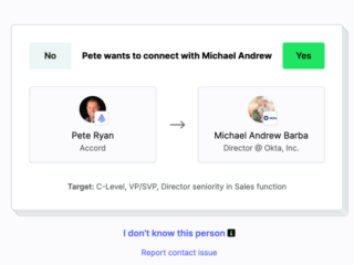
LeanDNA is rich in raw data reports, insights into trends, upcoming shortages, and excess inventory, but everyone struggled to find this valuable information. More importantly, it hindered standard work.
In short, reasons for this big change:
- Modernize design
- Remove steep learning curves and reduce training vosts
- Improve efficiency and enable faster completion of tasks
- Attract prospective customers
- Negative feedback from current customers


2. Discovery & user research
For the first six months, I led user research across internal employees and our customers, ranging from supply chain buyers and suppliers. I also did an in-depth audit of best-in-class software.
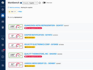
Suppliers is one of LeanDNA’s biggest personas; their LeanDNA experience is pared down to some reports (chosen by their buyers), and Workbench. We released their version first to test the general reaction and find any bugs.
3. Information architecture
The old experience didn’t have an easy-to-understand hierarchy; reports were in various places. After a lot of whiteboarding sessions with product managers, developers, and customer support managers, we came to an IA that we felt was flatter and easier to learn.


4. EA: Immediate feedback & response
Unsurprisingly, our EA users had a lot to say! They fell into two camps:
- New users: New customers never saw the original experience and found it easy to use, but were unsure how to navigate the overwhelming amount of reports
- “I’m used to the old way” users: The old experience had important information organized in random locations around the app, but users were used to relied on muscle memory and old habits.
Quick changes from internal & external users
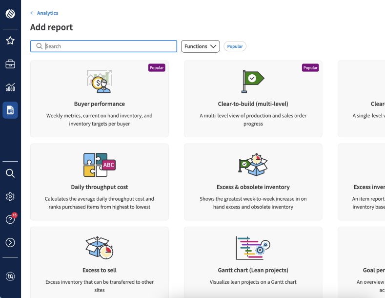
- They were vocal out how much they missed the old navigation sidebar where they could easily access most-used reports and dashboards. Although we had new list and favorite pages, the one extra click interrupted their muscle memory.
- Not released in the first version, grouping was highly demanded, so we prioritized that feature, which pushed back GA by a month.
- To optimize screen real estate based on user requests, I championed the implementation of a collapsible primary navigation alongside the ability to pin the secondary navigation, providing users with greater control over their workspace.
5. Gentle warnings & opt-ins/outs
We pushed a new login page to GA. For the webapp, the initial EA program was 1 company and then a slow wave for a few months. Everyone with the ability to opt-in or opt-out while giving us feedback why. As GA neared, we gave a firmer warning of the upcoming change. 80% of users opted to stay in!


6. GA
Before GA, we were at 95% opt-in! After an internal brown bag lunch, a public webinar, and a complete rewriting of our Knowledge Base articles, we went GA on March 31, 2025. Overall, users liked the more visual graphics of adding reports and dashboards and how quick it was to learn for new users.