01. Research
First, we needed a baseline of the existing portal. With the help of my UX researcher, we measured SUPR-Q:
User quotes
Make it simpler… the #$#@ is too complex for regular users… Make a simple graphic interface.”
“Make it easier for me… to both transfer and accept transfer, and add and delete installs.”
“Teach me how to use what I’m paying for.”
“I have a site on Squarespace and that design makes me feel more confident.”
“The reality is that you are still using a lot of phrases, that as someone who isn’t familiar with WP Engine, I don’t know how to read the data or make changes.”
02. Features & changes
Site navigation
To make the portal more scalable as our products grew, the navigation menu needed a makeover. After many rounds of testing and iterations, the final design proved to the right one as users finally understood what an account (i.e. billing) is vs a user profile.
Omni-search
There isn’t a global site search on the user portal, but there’s a basic table search (i.e. a filter) on the Sites list page. However, many users had hundreds of sites across many accounts. Without a global view of all accounts, the user would have to switch to accounts to find a site or environment.
We introduced the idea of a global search bar where a user can look for a site, or environment across all accounts.
As small as a search bar is, this feature quickly became the number one used component on the portal!
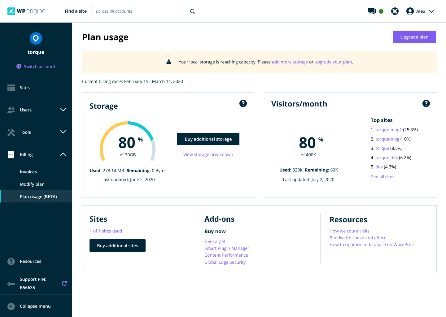
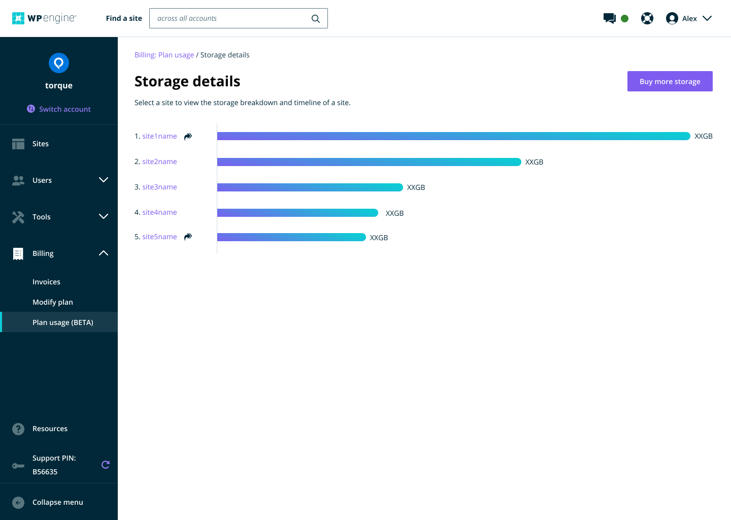
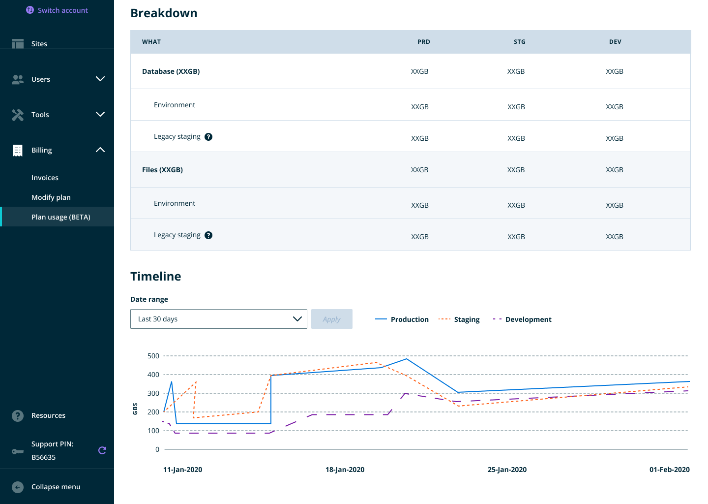
Plan usage
For years, users had no insight into their account usage. There was no insight into storage and bandwidth, which was reflected in their bill. Often, they found out too late they were out of storage and it was time to upgrade plans (or just delete some files!). This featured also cut down on support tickets and time for our CX team to manually build reports for customers.
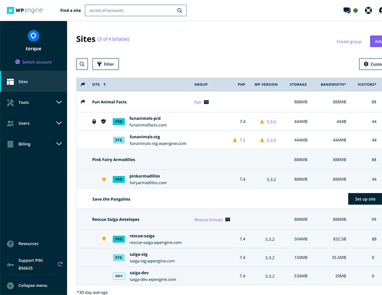
Sites table and quick actions
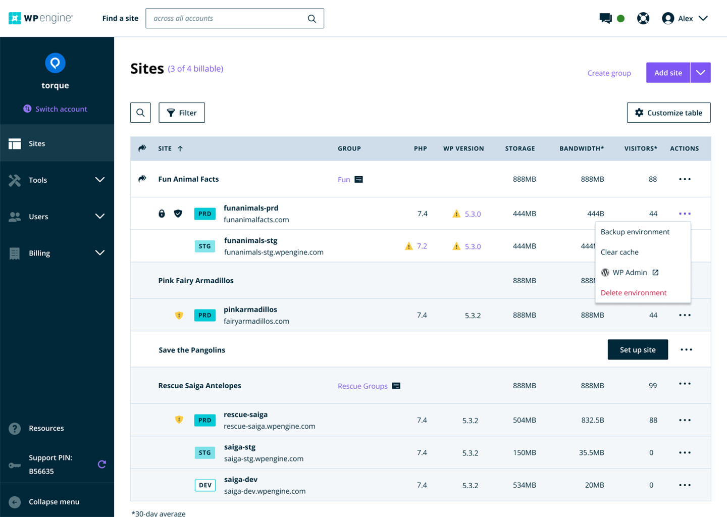
The sites list remains the most bookmarked page in the portal. However, it was essentially a list of links to individual sites with few options to do anything else. Sites couldn’t be sorted in any way to view by storage usage or visitors or alphabetically. Users had to click three to four times to get to the desired actions they performed often like backup or link to WordPress Admin.
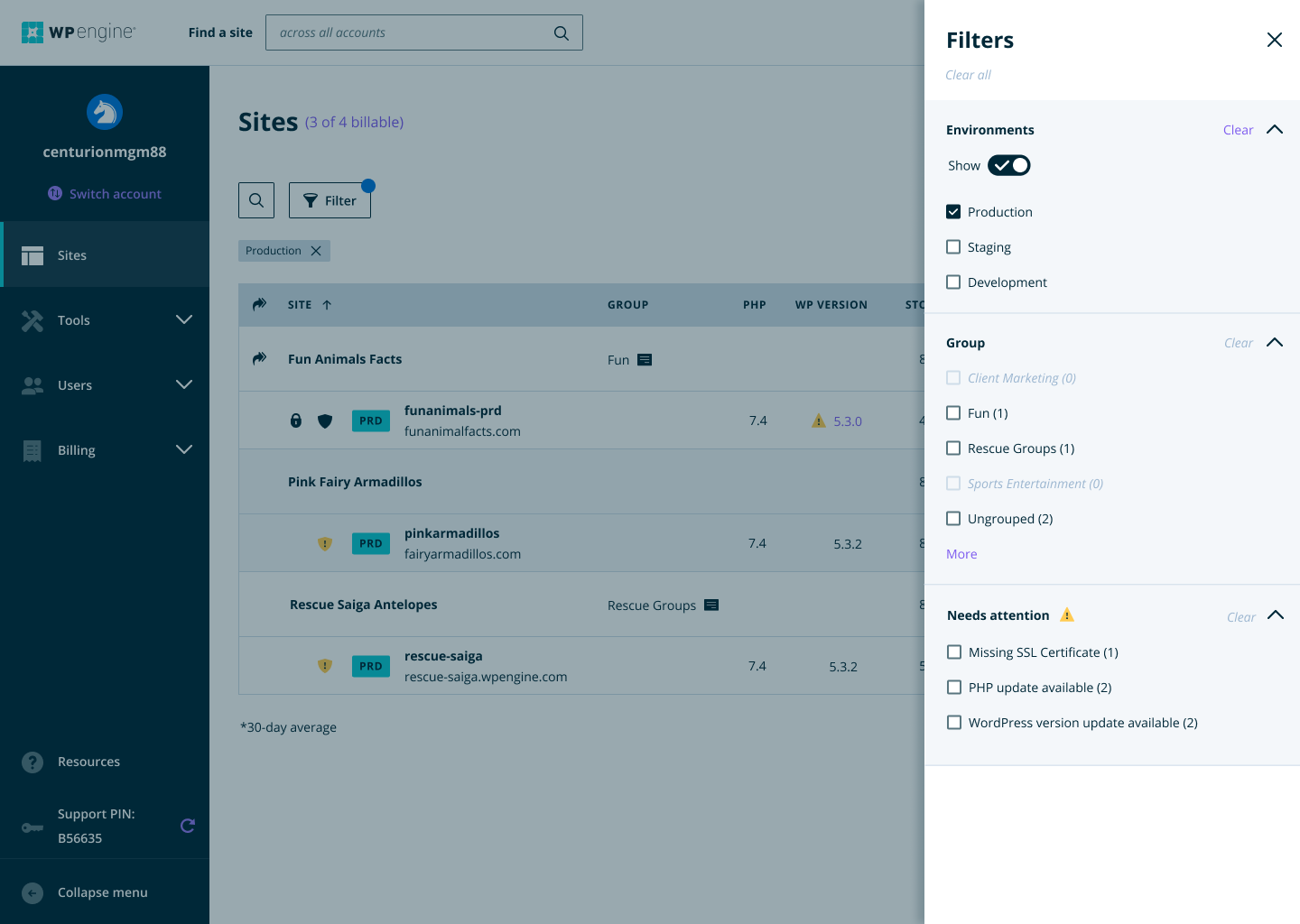
The new experience now offers a sortable table, a filter panels, quick actions, and the ability to customize columns.
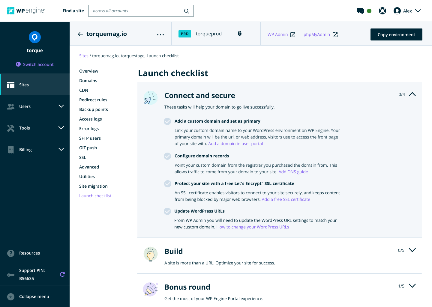
Build a site checklist & onboarding
For new (and even existing) users, the tasks and to-dos to get a site live can be daunting. Even the most experienced developer has a list. We created this checklist to mostly help inexperienced users, but also to help onboard them to the user portal.
03. User feedback
Here’s some feedback we got from users after all the changes.
“I think the WP Engine interface is really great. It’s why I pay more to be with this hosting platform.”
“I just wanted to let your team know that the new dashboard looks great!”
“I’m very grateful for this redesign. I didn’t even know how much I wanted it until I saw it. Thank you for making my job easy. And well done.”
“Tick, tick, tick, awesome.”


