Navigation redesign
For a decade, LeanDNA (a supply chain execution platform) relied on a static navigation experience. The outdated structure presented a significant barrier for new users and internal hires, hindering efficient onboarding and falling behind modern standards.
Company: LeanDNA
Role: Lead Product Designer
Partners: Every department (Marketing, Product management, Engineering, Customer Success, Customer support)
Problem
For a decade, users navigated a fragmented information architecture. Reports lived in random buckets across the app (e.g. a PO report under Supply Chain / Reports, a PFEP report under Supply Chain / Analytics / Purchased Inventory Opportunities). The result: users got lost, standard work time was impacted, and onboarding became expensive.
Discovery
For six months, I led user research across internal employees and our customers, ranging from supply chain buyers and suppliers.
Suppliers is one of LeanDNA’s biggest personas; their LeanDNA experience is pared down to some reports (chosen by their buyers), and Workbench. We released their version first to test the general reaction and find any bugs.
Insights
- Information was scattered. No logical hierarchy meant users relied on muscle memory or bookmarks which were workarounds for a broken system.
- Onboarding was painful. New customers and employees faced a steep learning curve, driving up training costs.
- The experience fell behind. LeanDNA's rich data (reports, insights, trend forecasts) was buried under outdated design patterns.
Solutions
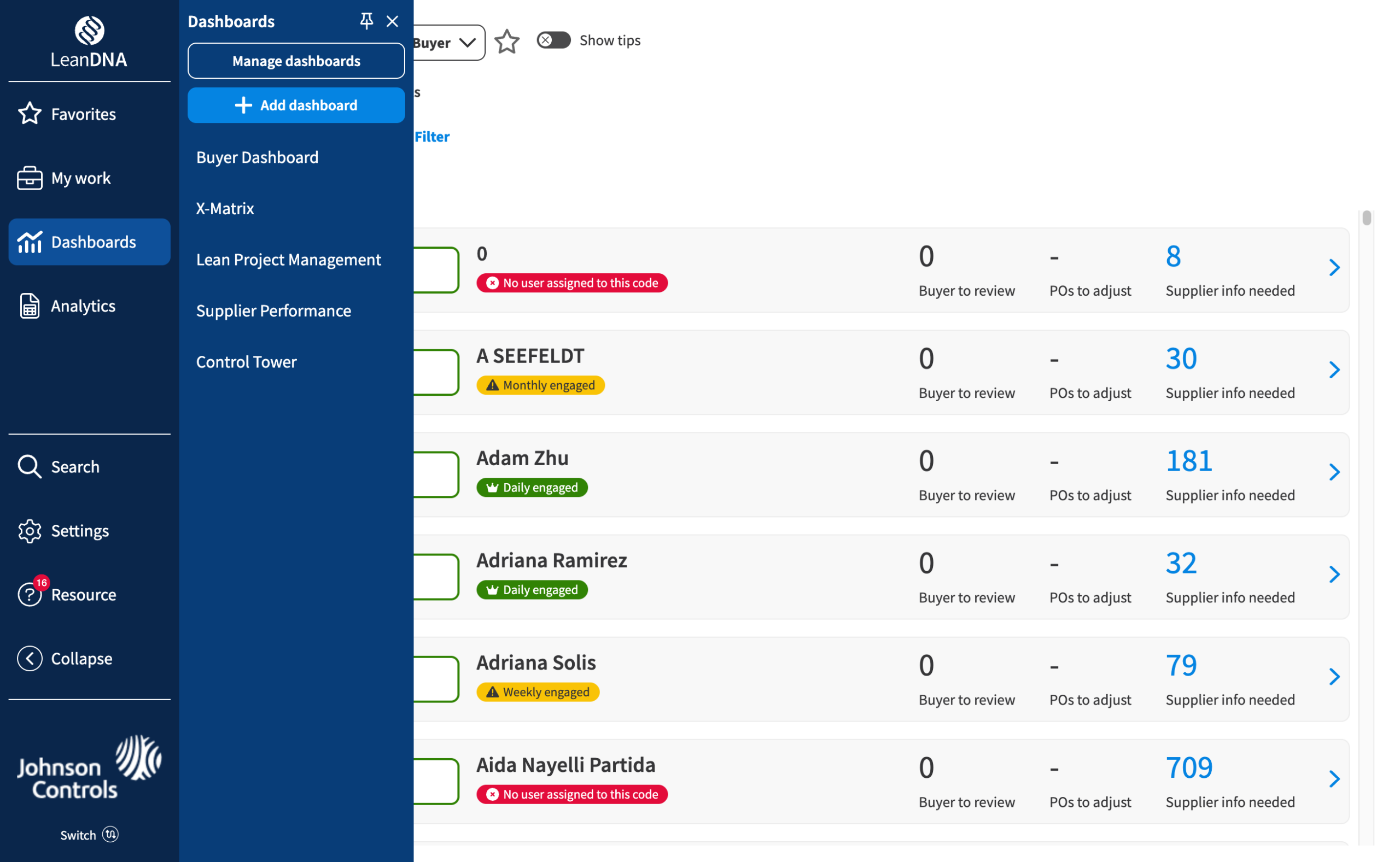
Navigation
What: Added a dark background to navigation, removed the top nav
Why: The previous top nav bar was the same color as the primary buttons; the side navigation was white and grey, which matched the content.
Logical sections
- What: Remapped contents into logical buckets (Reports, Dashboards, Settings)
- Why: Previously, reports were grouped in various buckets in different areas (ex: PO report was in Supply chain / Reports, but PFEP report was under Supply chain / Analytics / Purchased inventory opportunties)
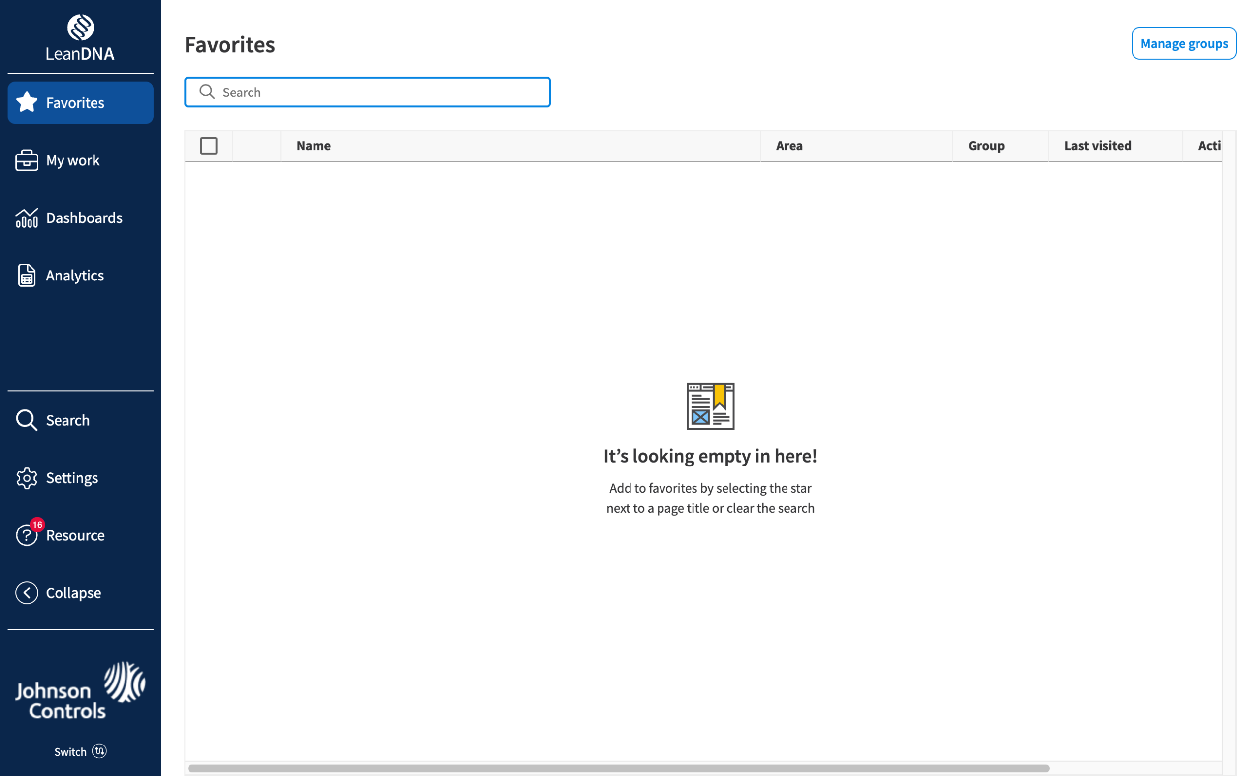
Favorites
- What: Every page could be favorited with a favorites page to view
- Why: Users were bookmarking their most used pages because they were hard to find, so I made it native.
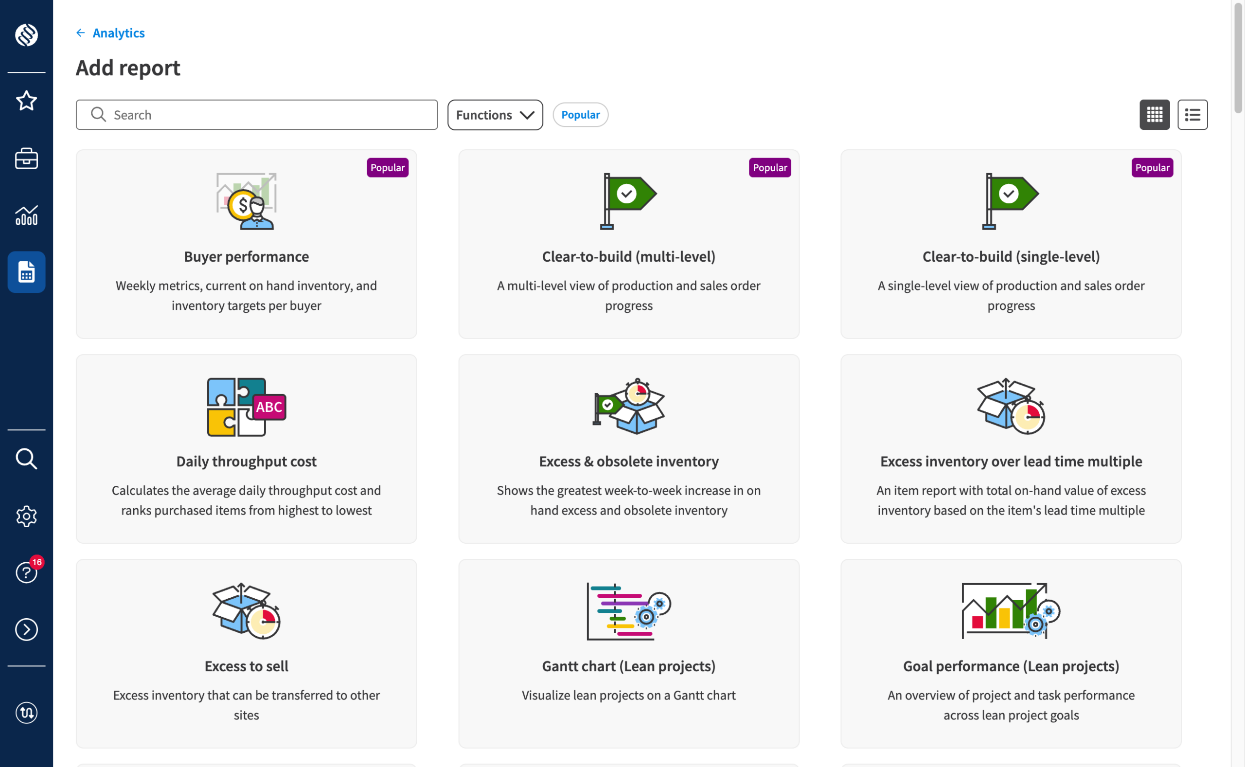
Add reports & dashboards
- What: A dedicated visual interface with search, filters, and popular indicators
- Why: Previously hidden in a "save copy" function, adding reports was nearly impossible to discover.
Initial response
User feedback drove prioritization. Frouping wasn't in v1, but users demanded it, so we delayed GA by a month to ship it right.
To respect power users, I added collapsible navigation and pinnable secondary menus, giving users control over their workspace instead of forcing them into ours.

User types
- New users who found it intuititive
- Power users who initially resisted the change but quickly adapted once we added their must haves
- Previously frustrated users said it was "much cleaner, more intuitive"
95%
opt in, pre GA
Everyone with the ability to opt-in or opt-out gave us feedback why. As GA neared, we gave a firmer warning of the upcoming change.
GA
After an internal brown bag lunch, a public webinar, and a complete rewriting of our Knowledge Base articles, we went GA. Overall, users liked the more visual graphics of adding reports and dashboards and how quick it was to learn for new users.