
User portal
As WP Engine continues to grow a digital experience platform, hosting will always be the core product. After eight years, the user portal had become outdated in regards to UI, usability, interaction, and accessibility.
Company: WP Engine
Role: Senior Product Designer
Partners: Product management, Customer success, Engineering, Marketing
Discovery
First, we needed a baseline of the existing portal. With the help of my UX researcher, we measured SUPR-Q and interviewed a variety of users:
- “Make it simpler...the #$$@ is too complex for regular users...Make a simple graphic interface.”
- “Make it easier for me...to both transfer and accept transfer, a nd add and delete installs.”
- “Teach me how to use what I'm paying for.”
- “The reality is that you are still using a lot of phrases, that as someone who isn't familiar with WP Engine, I don't know how to read the data and make changes.”
- “I have a site on Squarespace and that design makes me feel confident.”

SUPR-Q measurements
- Usability: 4.01
- Navigation: 3.88
- Ease of use: 4.15
- Appearance: 3.96
- Attractiveness: 3.84
- Simplicity: 4.08
- Credibility: 4.48
- Comfort: 4.49
- Confidence: 4.47
- Loyalty: 4.05
- Likely to return: 4.74
- Likely to recommend: 4.05
Solutions

Site navigation
Users couldn't distinguish between account settings (billing) and user profile settings. Through testing and iteration, I created a clearer information architecture that made these distinctions obvious.
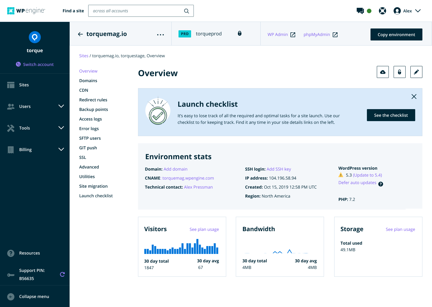
Omni-search
Users with hundreds of sites across multiple accounts faced a painful workaround: switching between accounts to find a single site. We added a global search bar. It became the most-used component on the portal overnight.
Usage insights
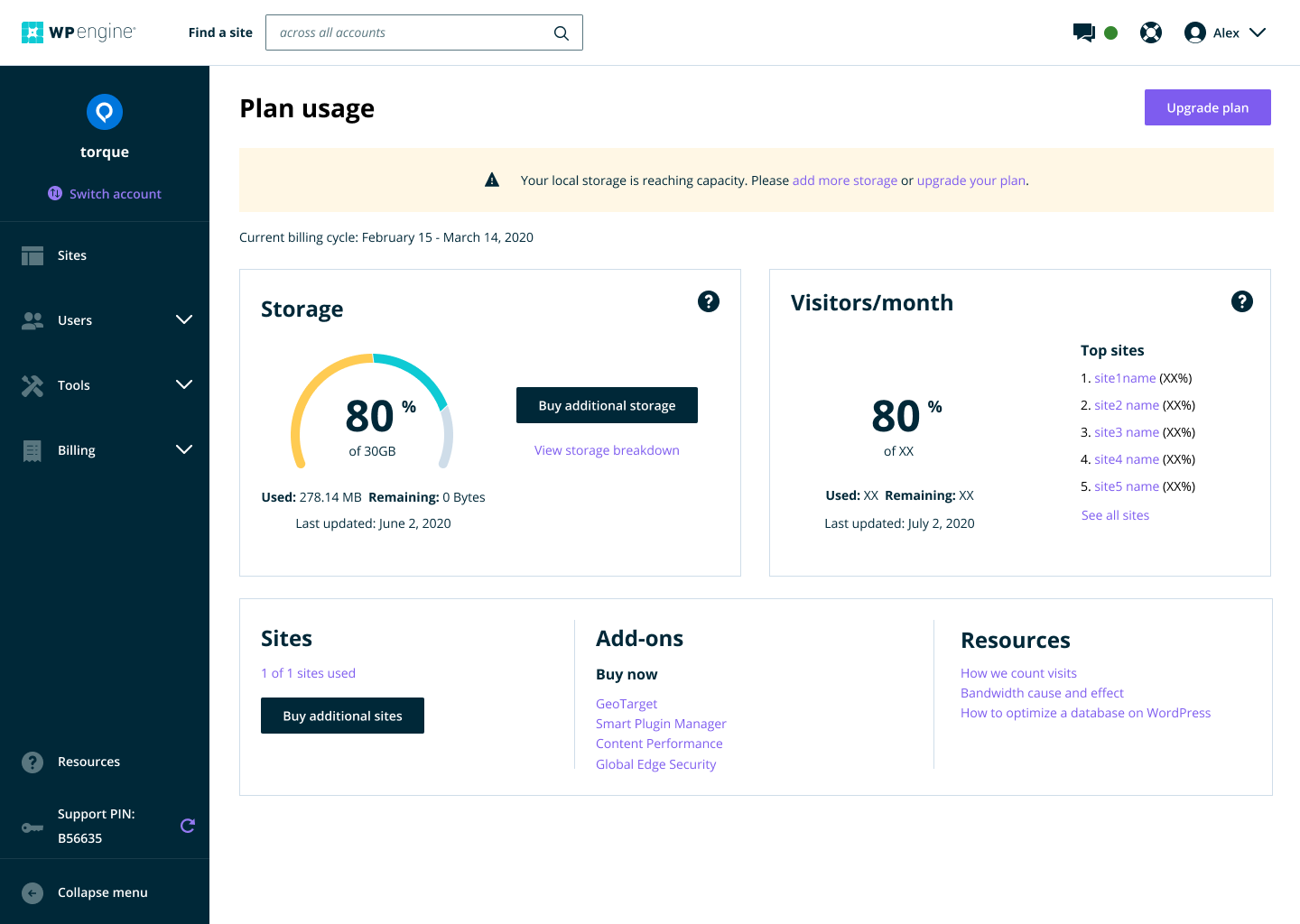
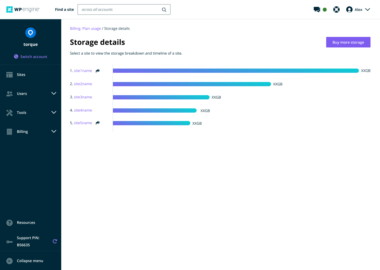
For years, users had no visibility into storage and bandwidth usage until they hit limits and got surprised by their bill. We surfaced real-time usage data, reducing support tickets and eliminating the need for our team to manually build reports.
Site management
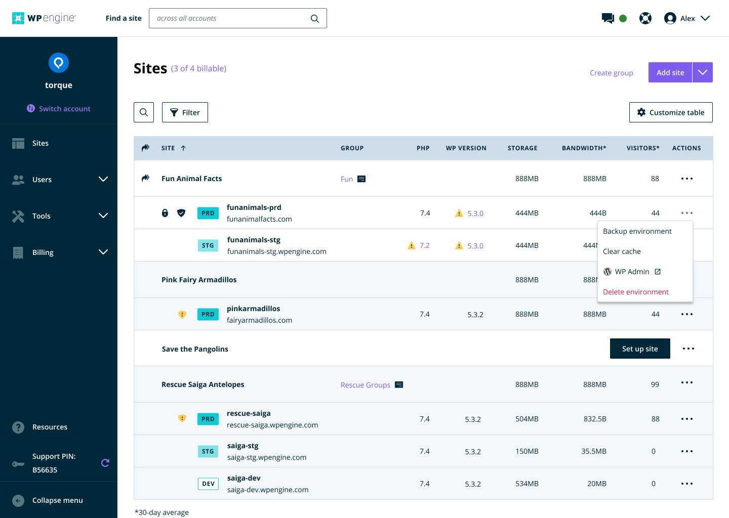
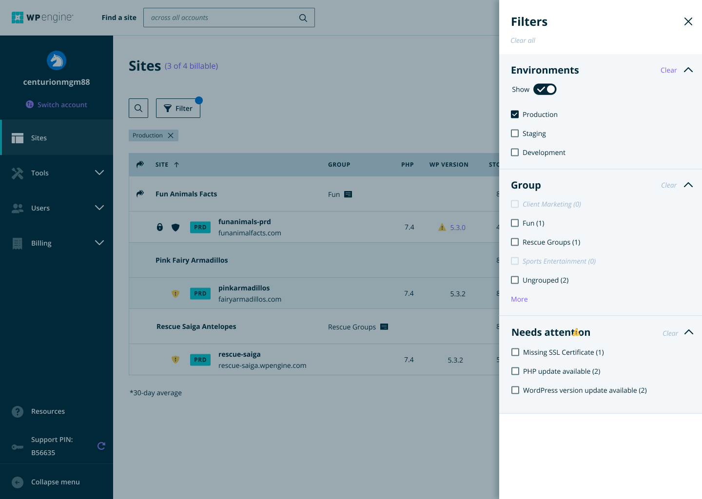
The sites list was the most bookmarked page, but it was just a list of links. Users couldn't sort by usage or traffic, and accessing common actions required 3-4 clicks. I added sortable columns, filters, quick actions, and customizable views.
Onboarding checklist
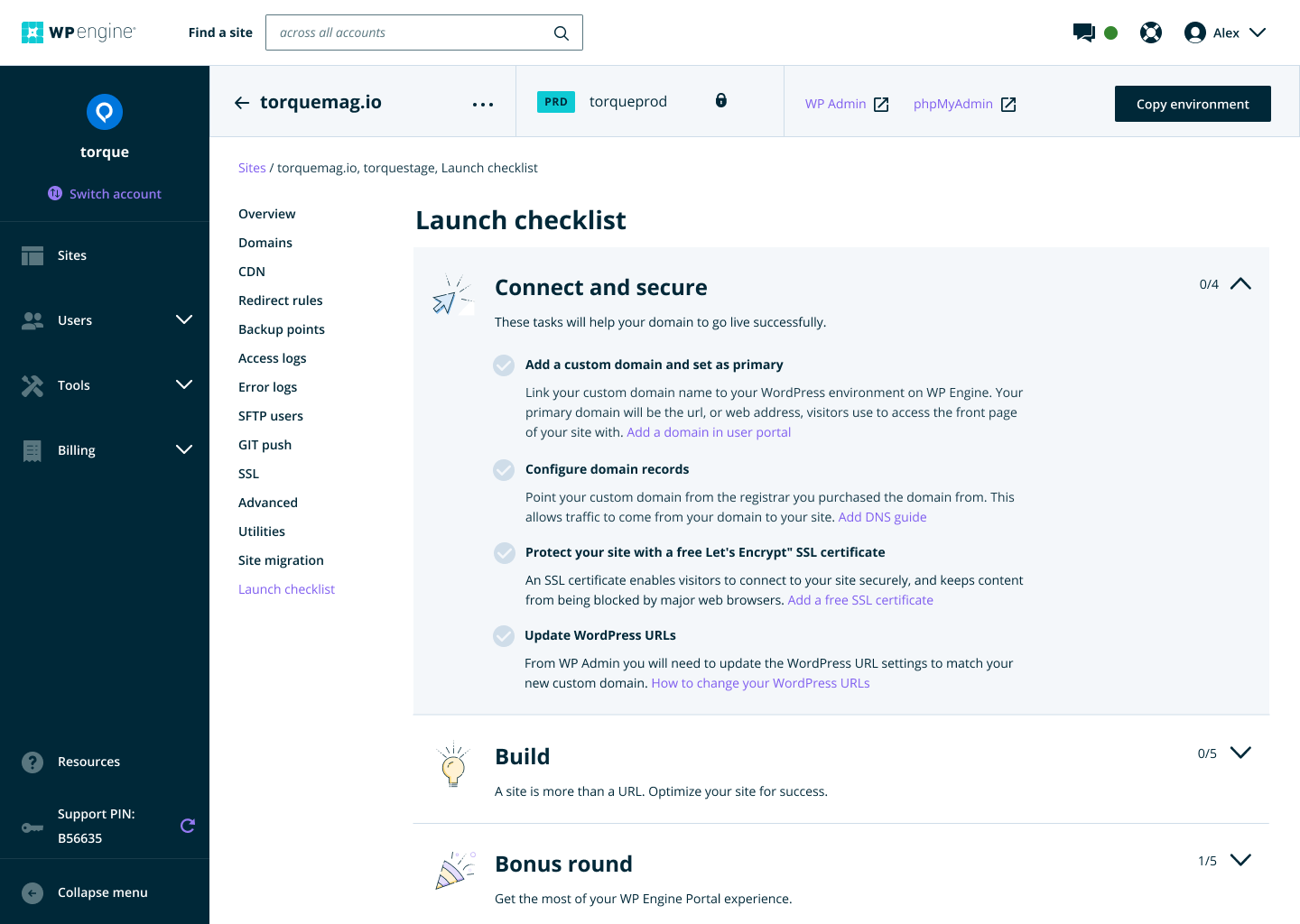
We created a guided checklist to help new users navigate the tasks required to launch a site, turning a daunting process into a clear roadmap.
Customer validation
Along with a new design system, the rollout of the portal refresh was very successful with users across the board.
“I'm very grateful for the redesign. I didn't even know how much I wanted it until I saw it. Thank you for making my job easier. And well done.”
“I just wanted to let your team know that the new dashboard looks great.”
“Tick, tick, tick awesome.”