1. Problem
Partners could only see revenue data; there wasn’t an easy way to find that data (the link was hidden). There wasn’t a central location for them to edit their listings, get feedback from us, view analytics, or create pricing campaigns.
2. Discovery & user research
To understand what partners needed from us, I did 10-15 user interviews and concept tests from our current partners. The conversations were performed over Zoom with questions ranging from their definitions of success to what the portal could be for them. I concept tested with low-fidelity wires.
3. Information architecture
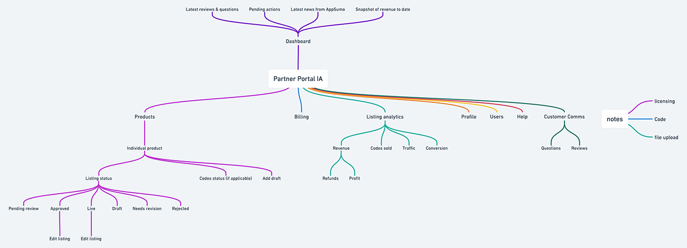
The Partner Portal was a chance to create SaaS from scratch, which is a rare opportunity for a designer. With input from stakeholders such as partner success managers, I mapped out what the portal could be.
4. Design
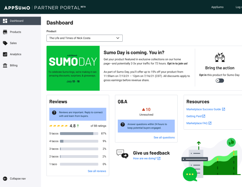
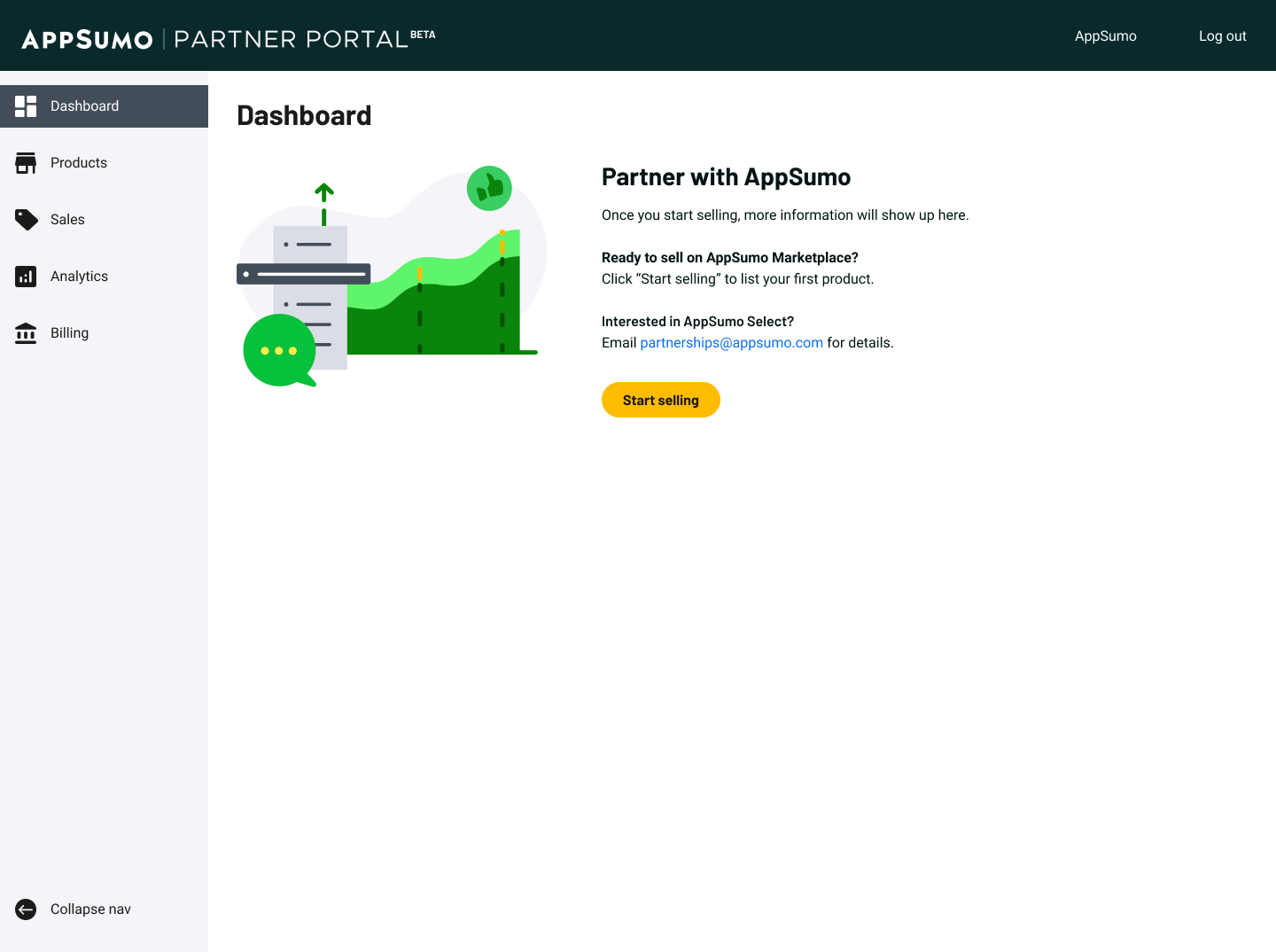
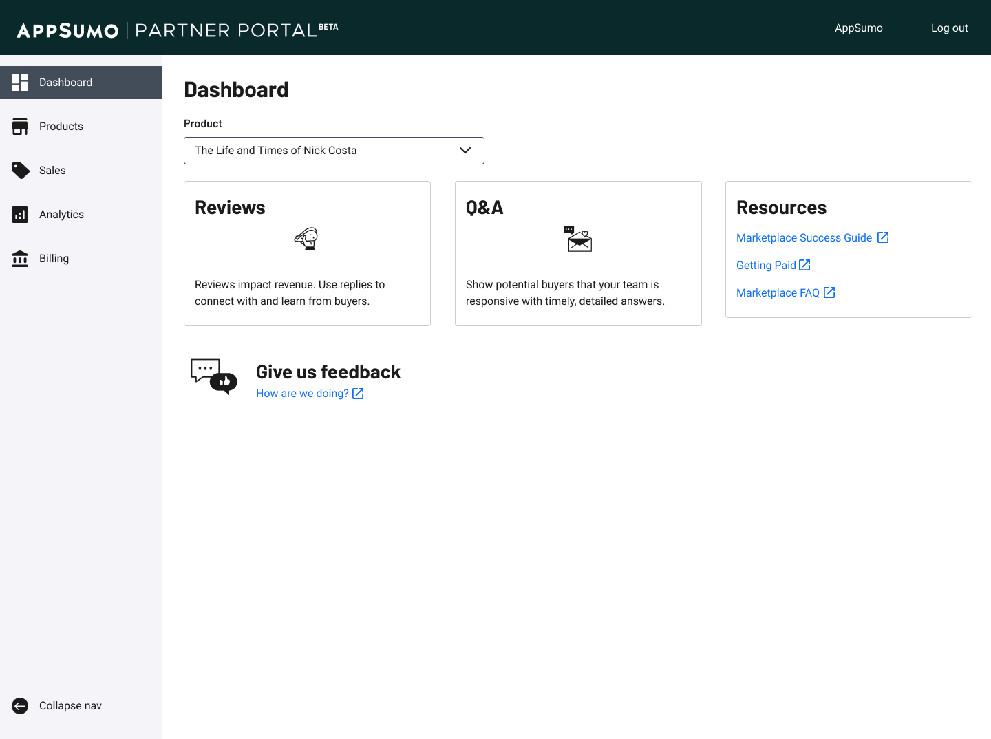
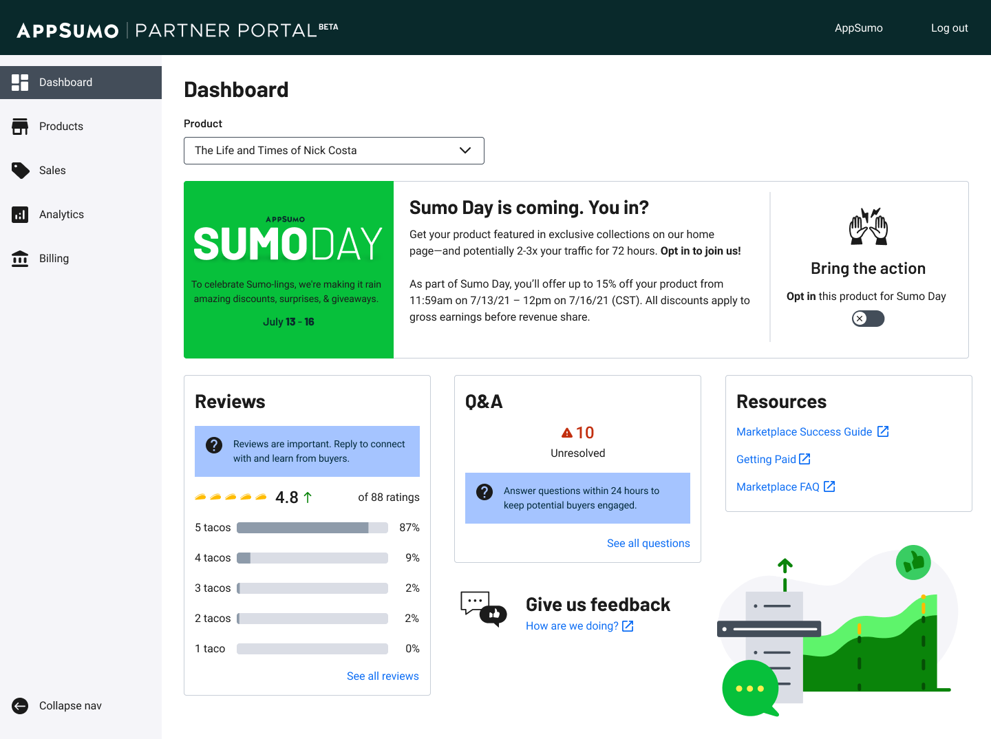
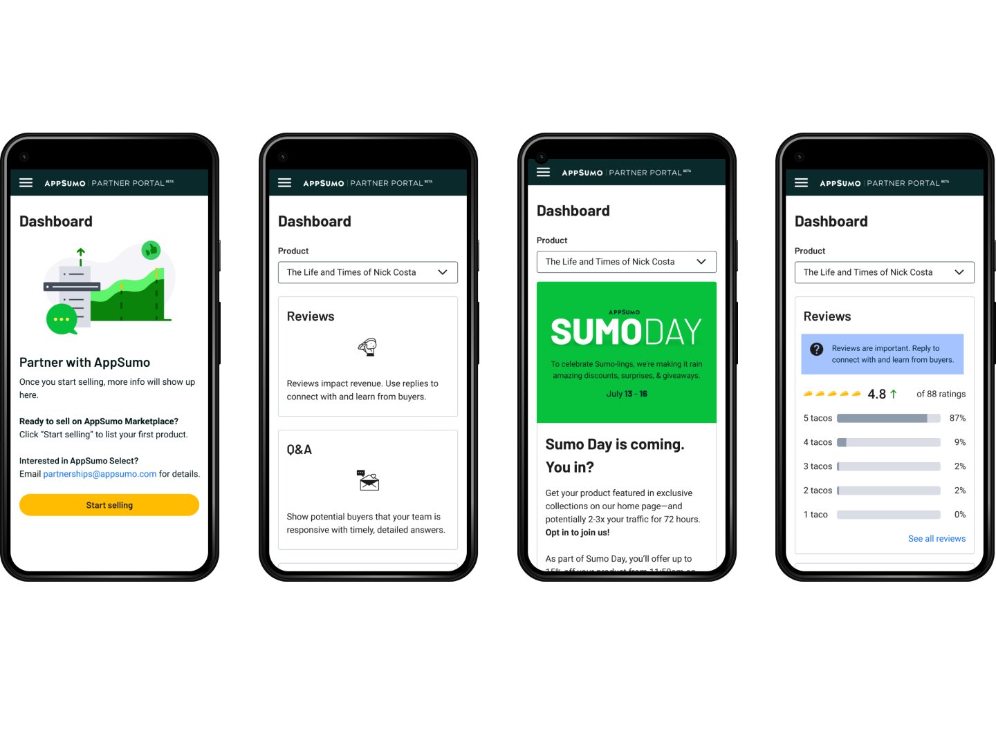
Dashboard
The dashboard view offers snapshots of information for the user. These cards will eventually lead to more detailed sections.
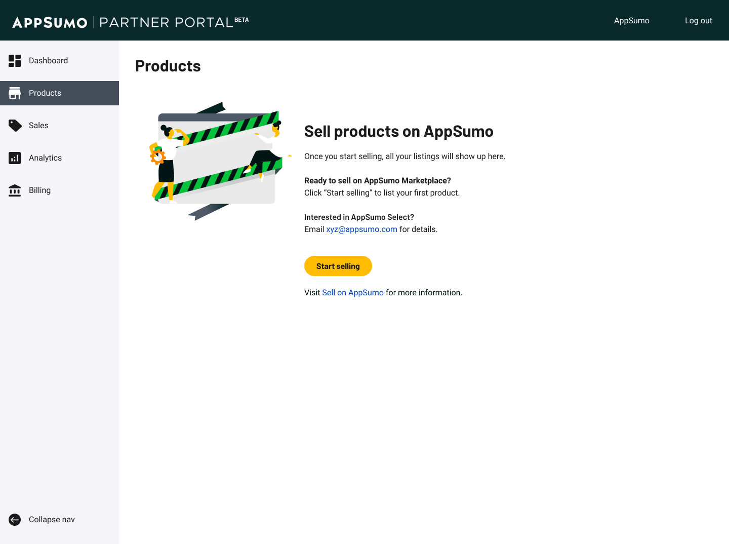
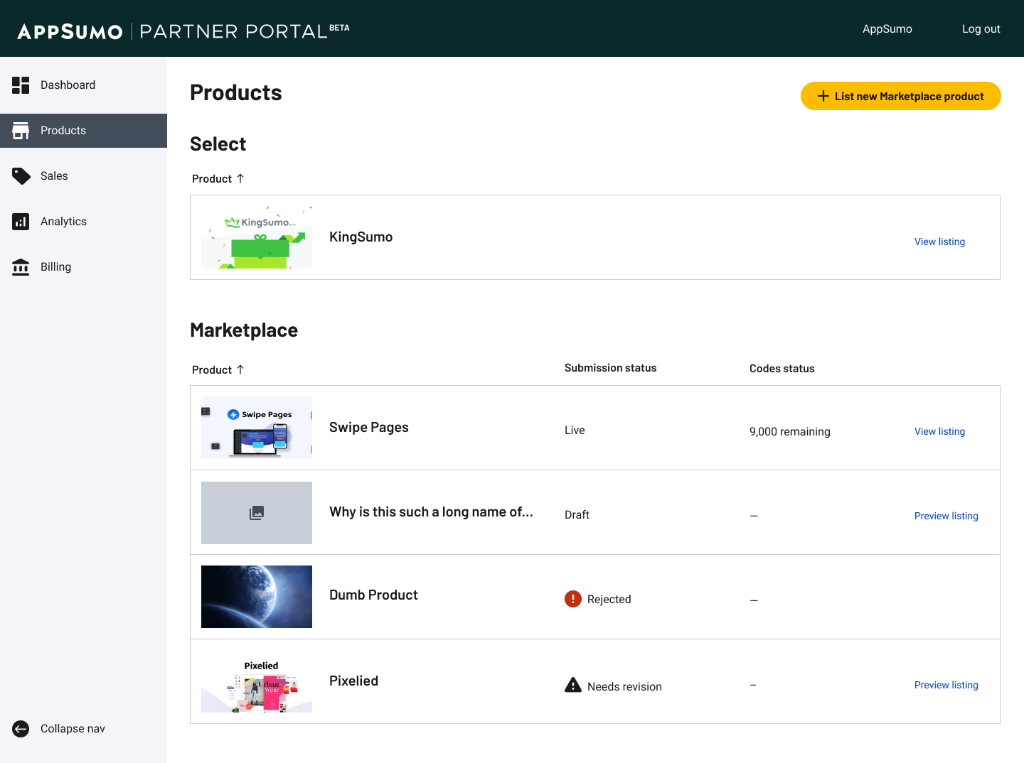
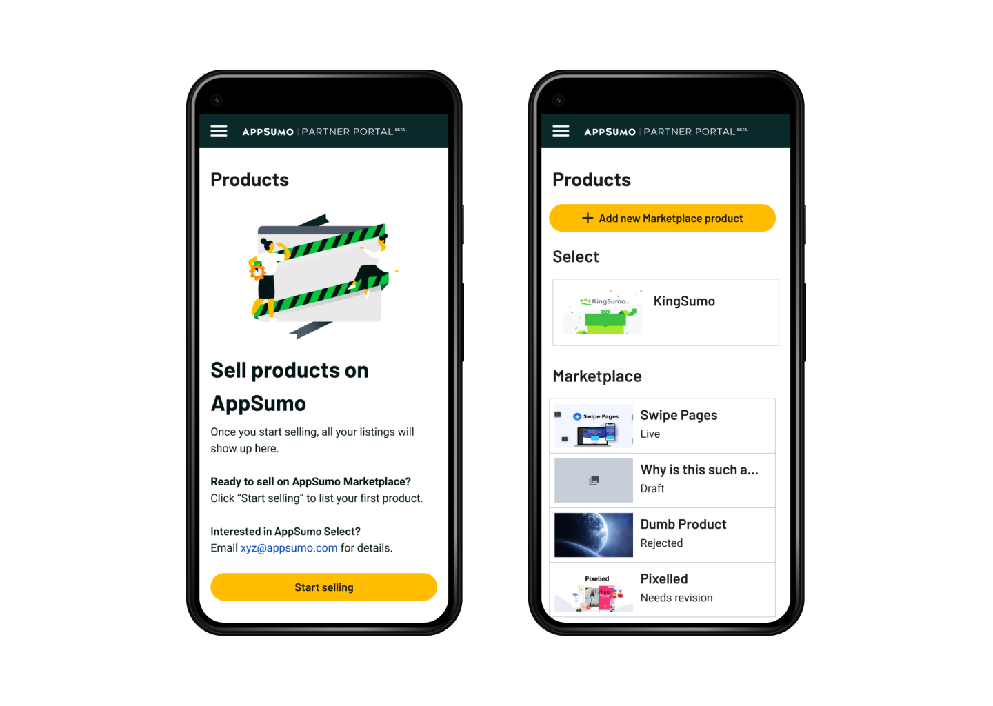
Products
Most partners will only have on product, but for those who have many, this view will give them a status of all products, which lead to individual pages with more information and actions.


