1. Problem
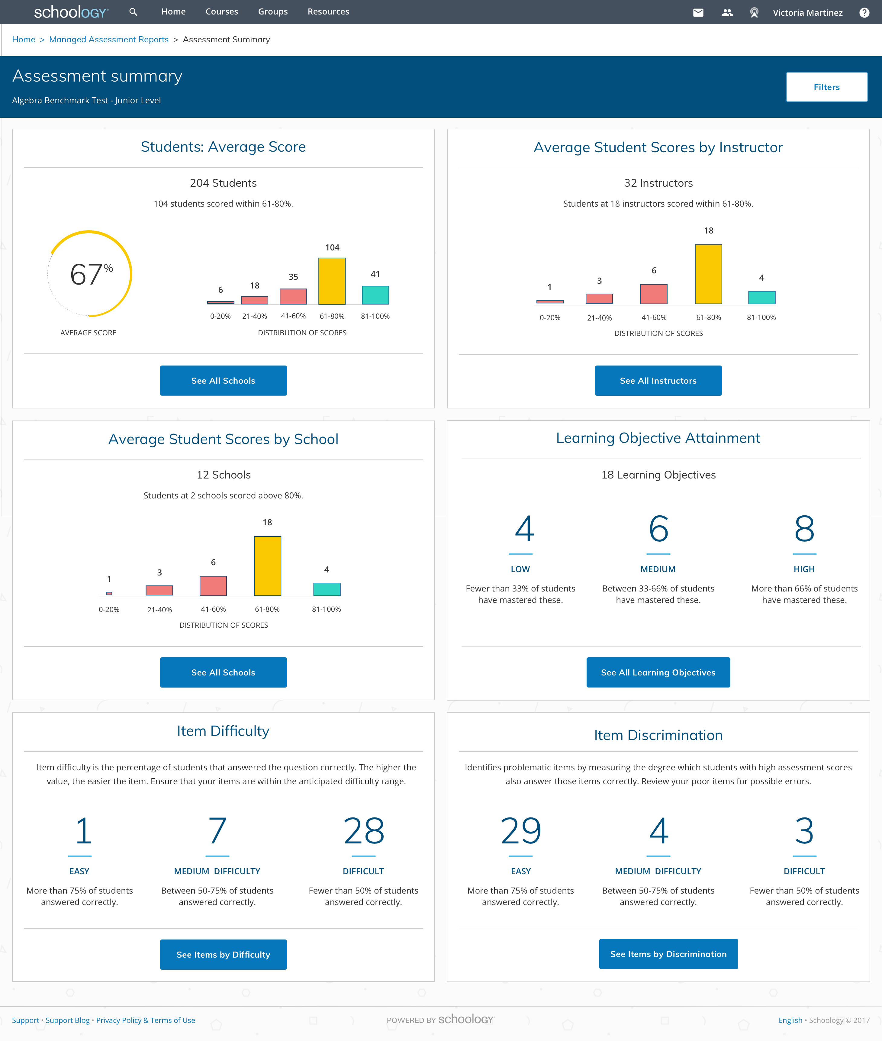
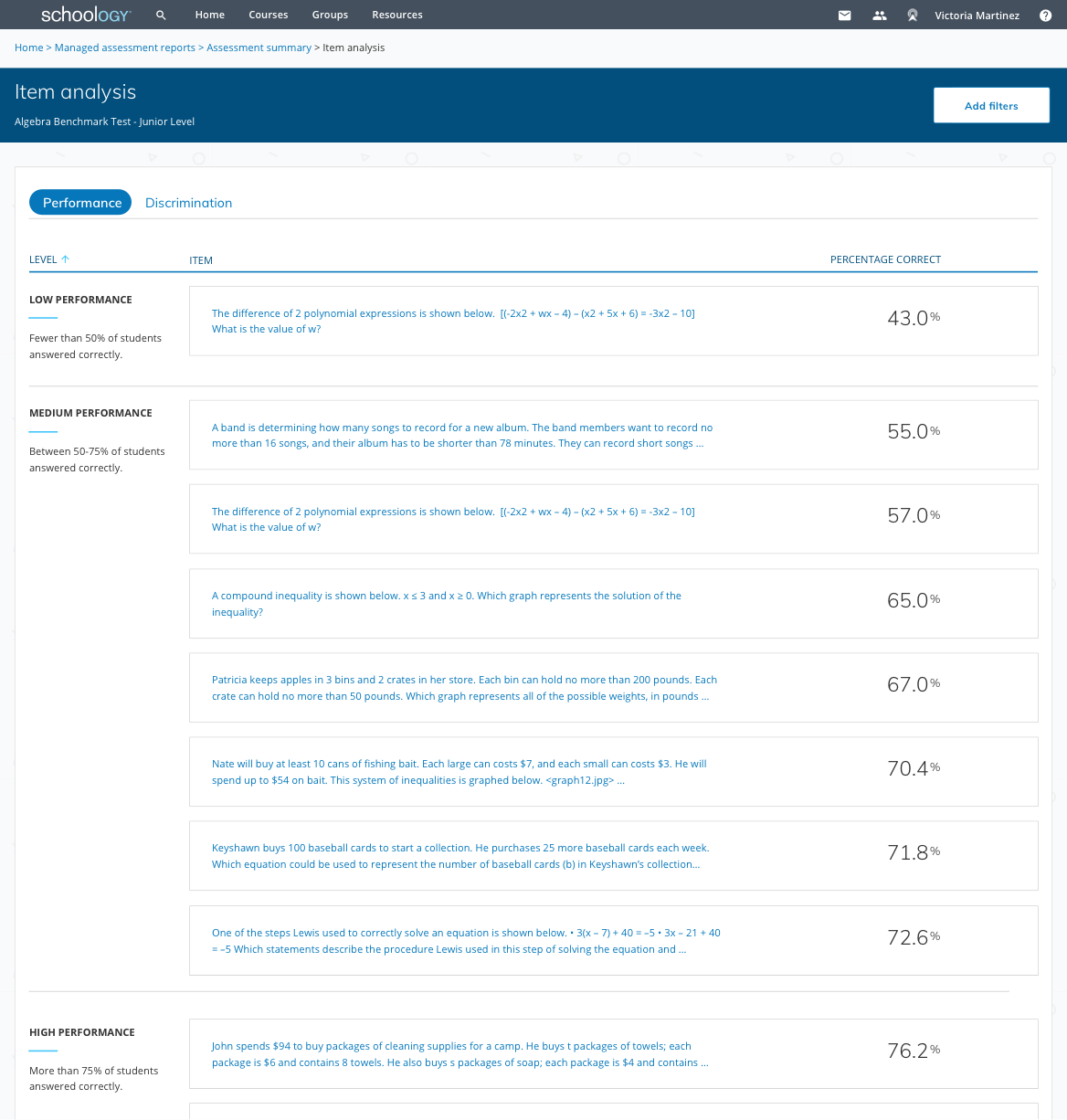
The existing item analysis tools are often spreadsheets and long tables of numbers that are hard to decipher and/or take action on. Educators need a way to assess quickly which students are struggling and why. Item discrimination and item difficulty are also not well-known terms by teachers. Currently, there are no ways to filter the data by demographics to identify struggling groups (ex: Special Ed or PHLOTE/Primary Home Language Other Than English).
2. Plan
Goals
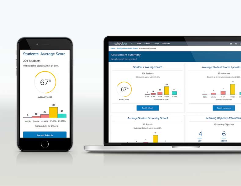
Create a report within Schoology’s Managed Assessment Reports tool that can be quickly understood by all types of educators (district admins, assessment teams, and instructors) to identify problematic items or struggling students in order to take necessary action. All designs and functionality must be accessible.
Expected impact
Additional assessment scores will increase (as well as item discrimination scores). Users will re-teach areas that all students have missed, re-write questions, give resources to struggling students, and assign advanced material to students that are excelling.
3. Users
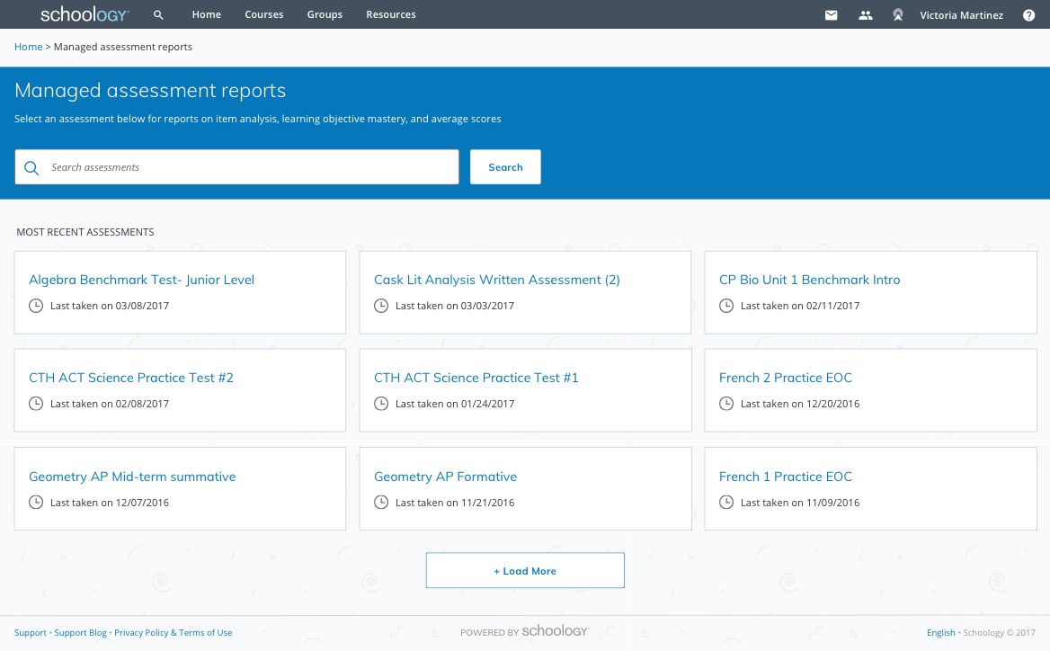
While Schoology users range from students to parents to educators, the Managed Assessment Reports is only useful and accessible to educators. Within educators, there are a variety of roles and permissions.
4. Schema & flow
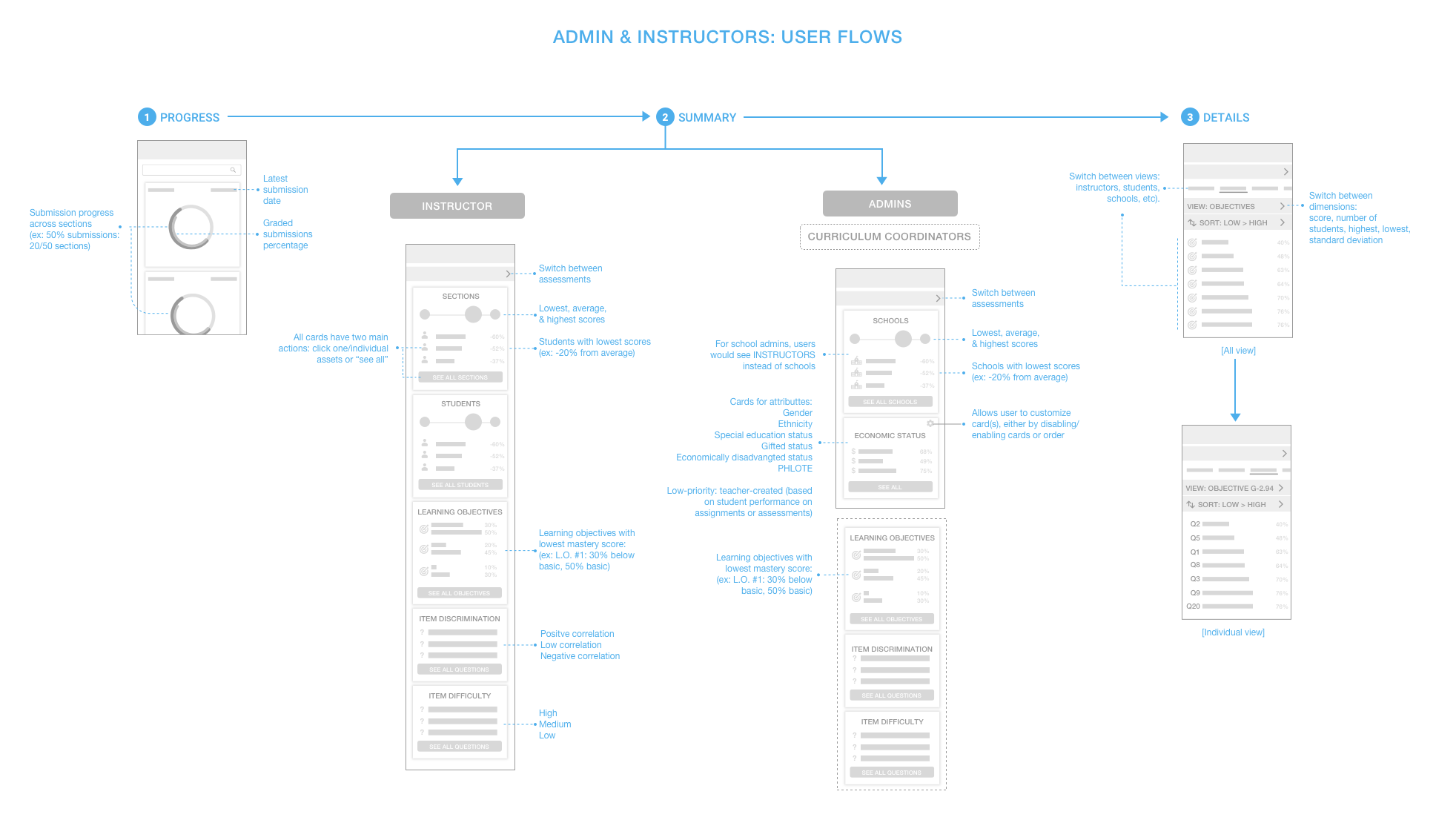
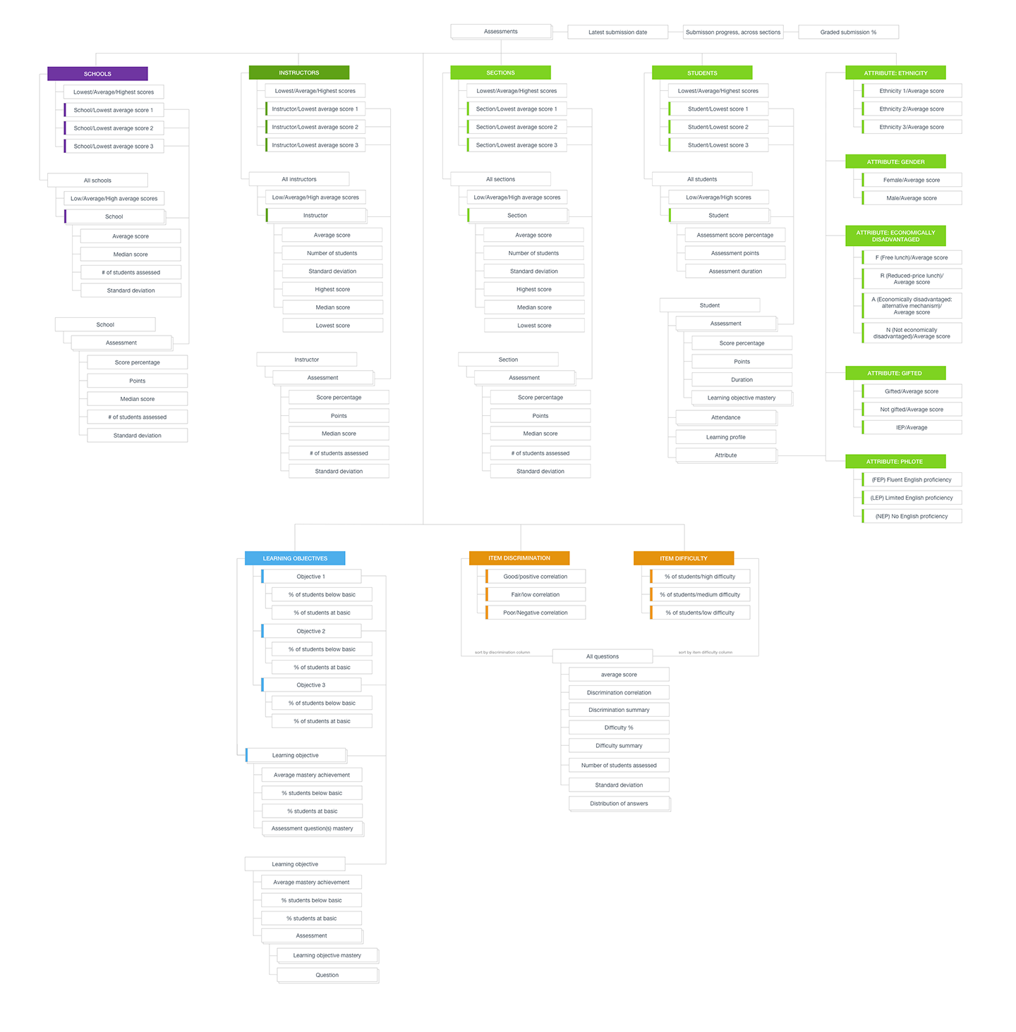
Due to all the user roles and data points, I mapped out all the possibilities. The user flow was created from mobile screen thumbnails.
5. Testing with wireframes
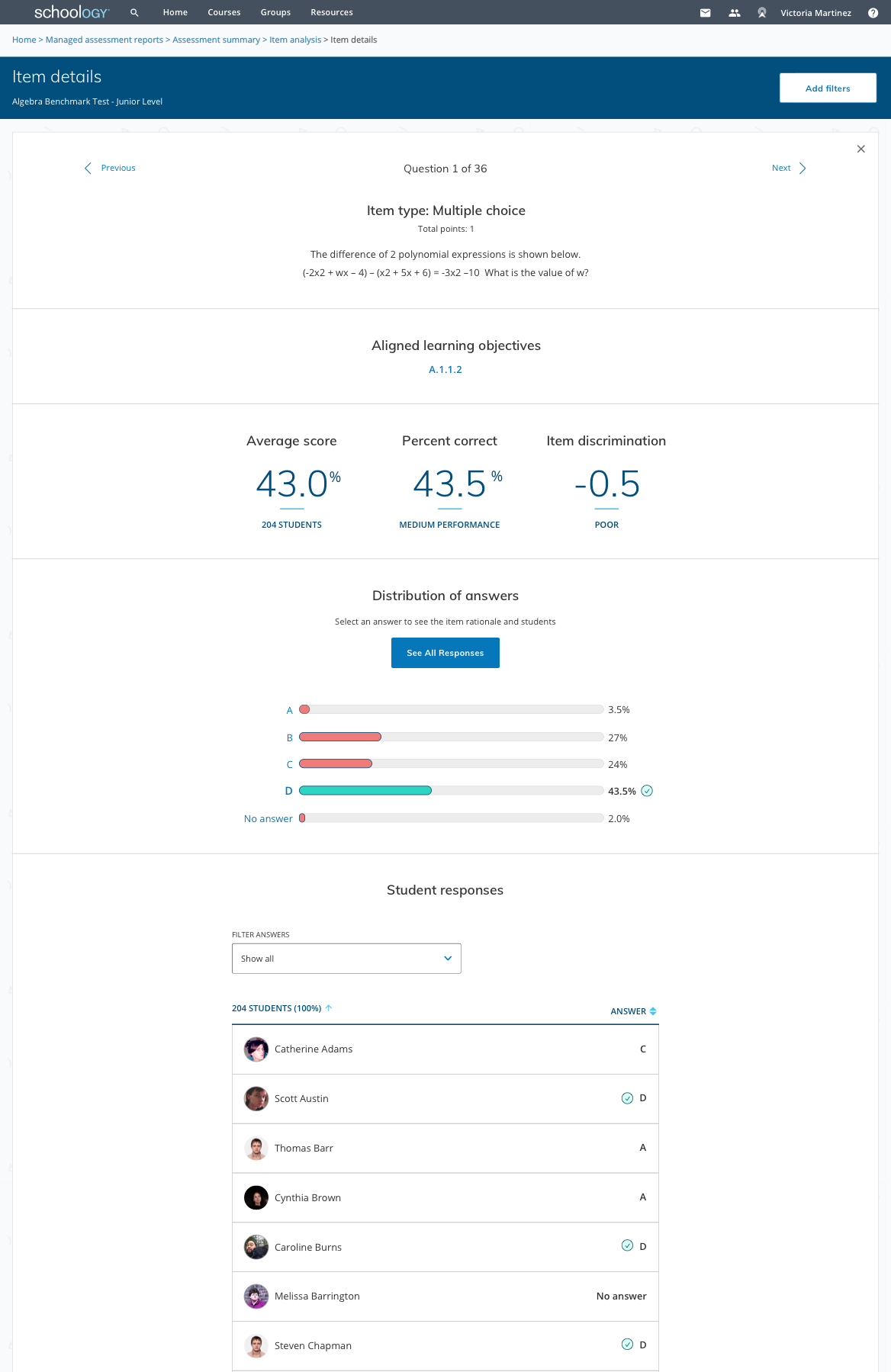
We had insightful and useful feedback and overall, the feedback was incredibly positive and excited for the future. When the got to the crucial “Item details” page (metrics about an individual question such as number of students assessed, student responses and percentages, distractor rationale, etc), we had enthused replies of, “THIS is HOT. This is what I wanted. This is why we’re going to buy.”
My product manager and I refined the definition for item discrimination and difficulty to be friendlier and give users an action.


