01. Audit
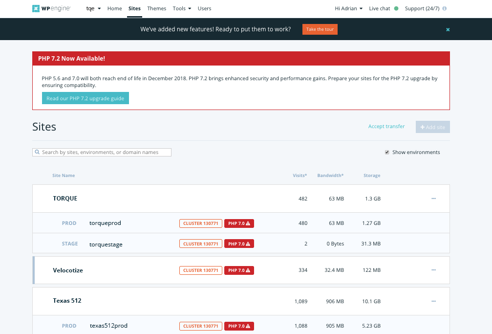
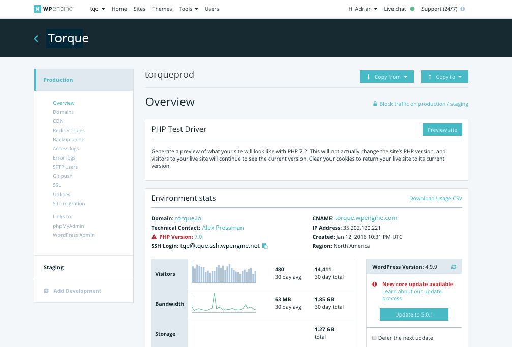
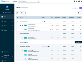
Before we started a new system, we had to audit every button, every header, every color swatch and document its many uses across the User Portal. We often found four or five different styles for a single component.
02. Acceptance criteria
- Must follow W3C AA guidelines.
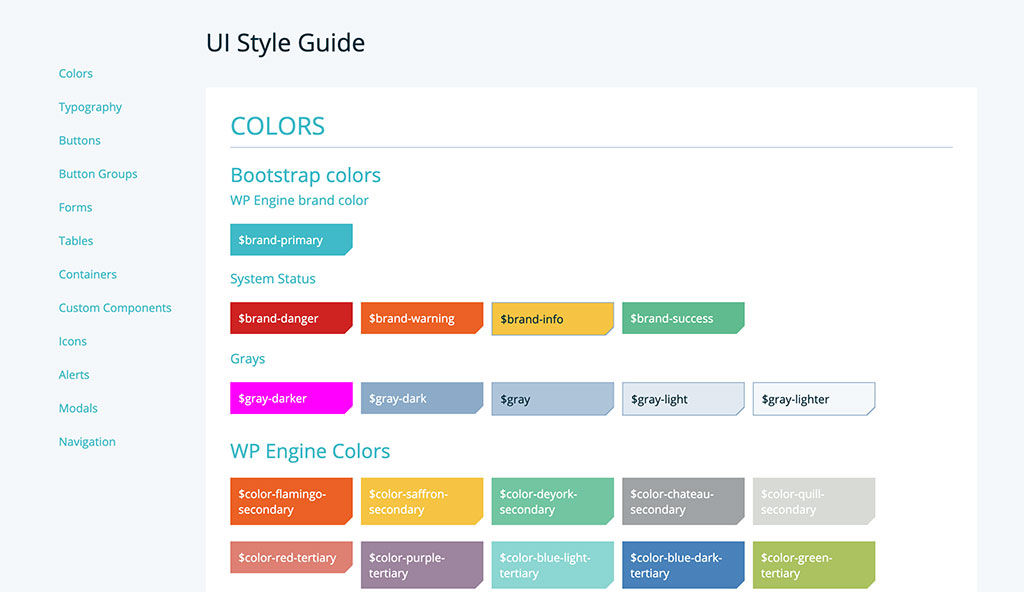
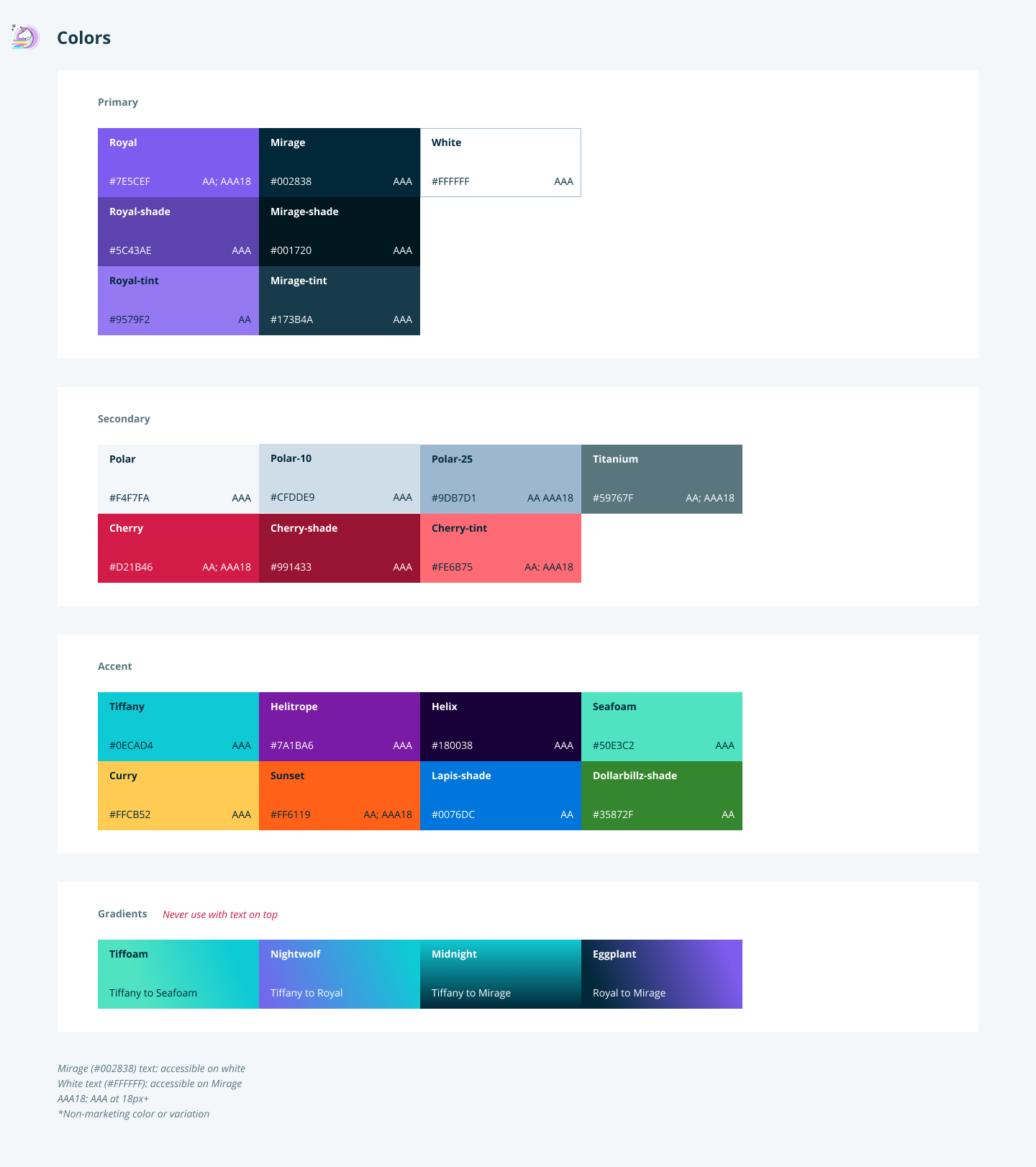
- Define new colors based on the .com/Marketing swatches.
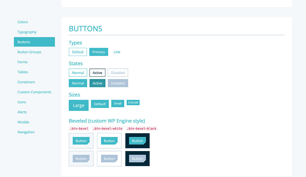
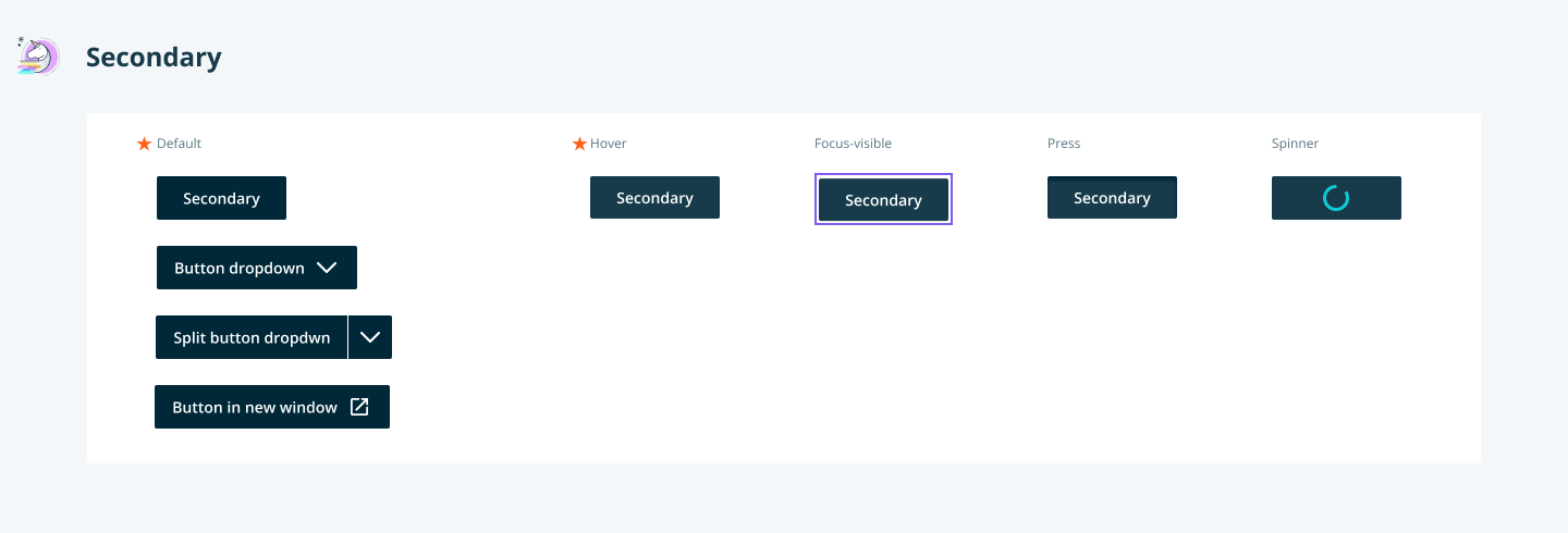
- Design new components from scratch.
- Create easy-to-use library in Sketch for designers.
- Build React components.
- Push adoption through R&D.
03. Design, test, and iterate
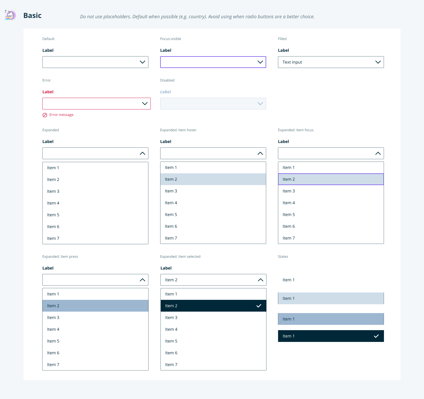
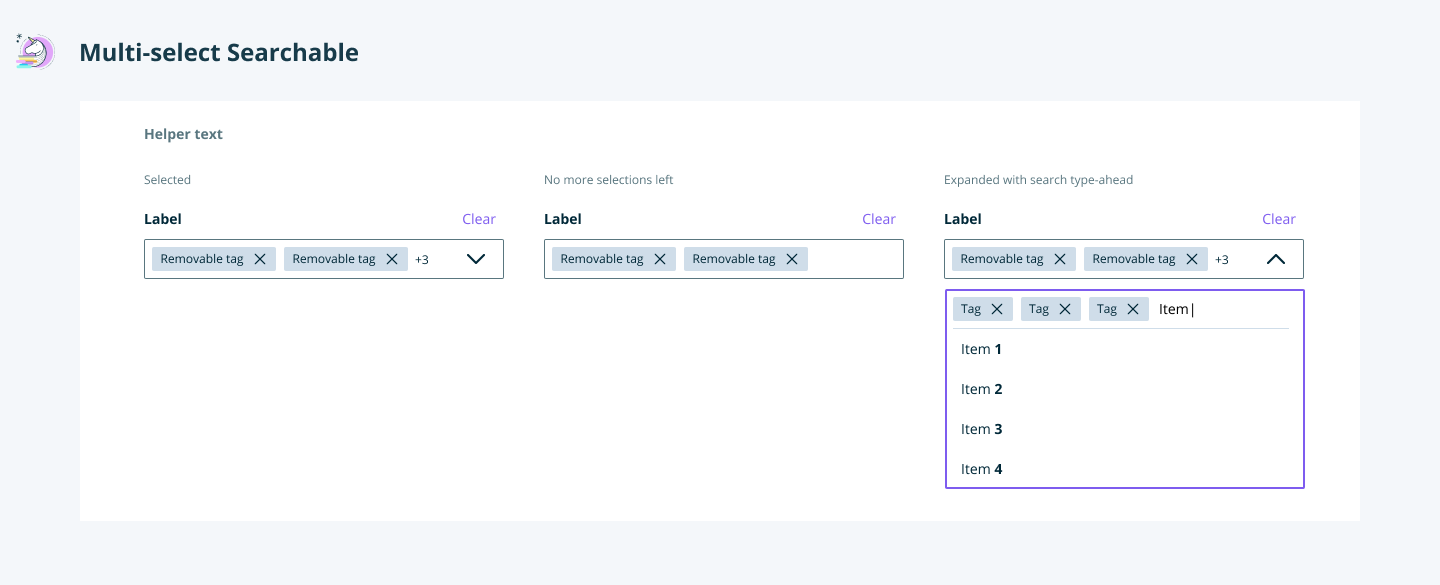
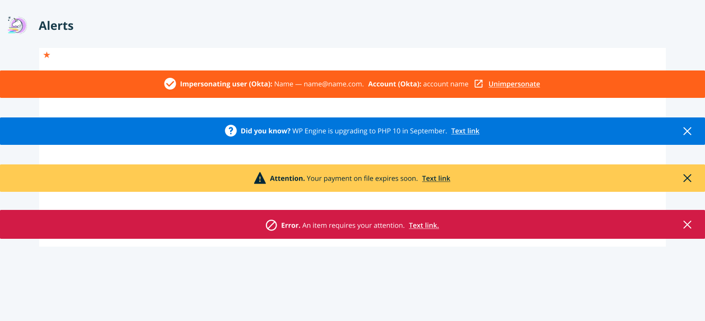
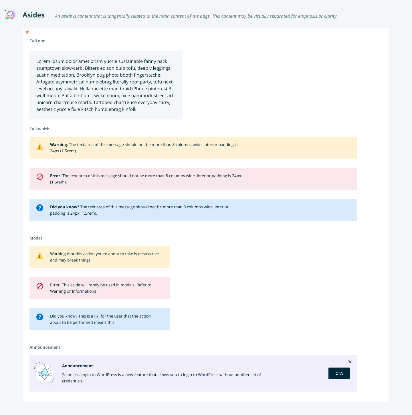
Unicorn is a living product that is continuously being worked on and updated, including a dark mode.
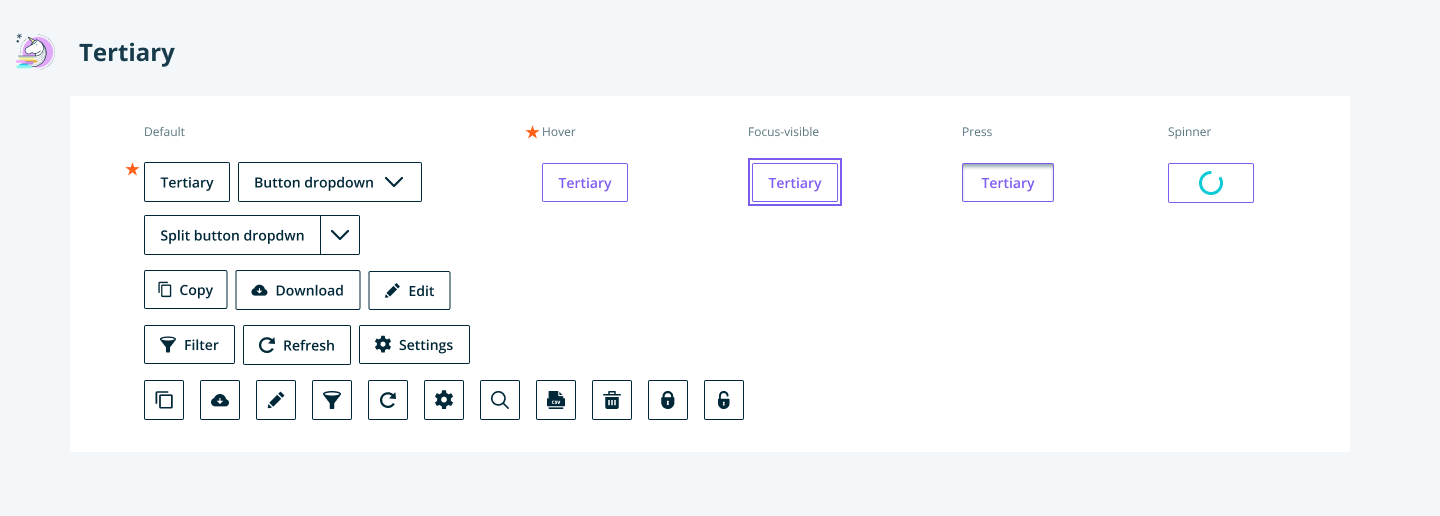
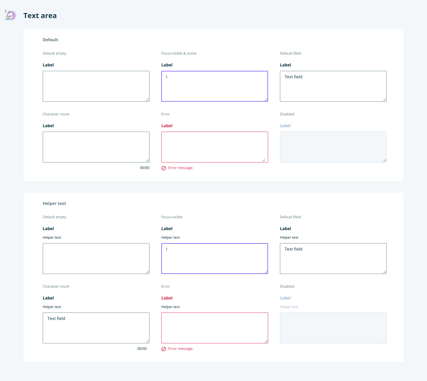
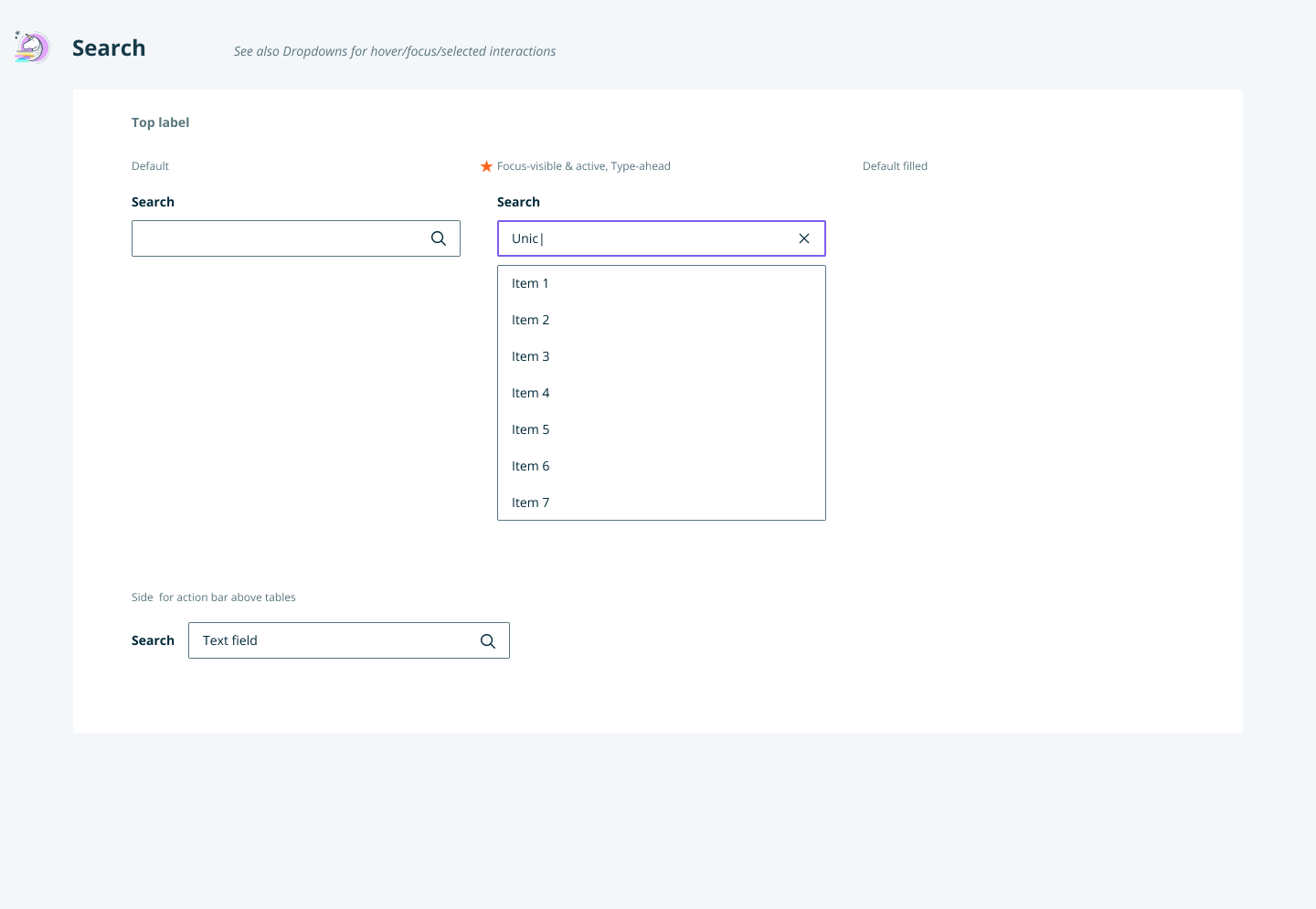
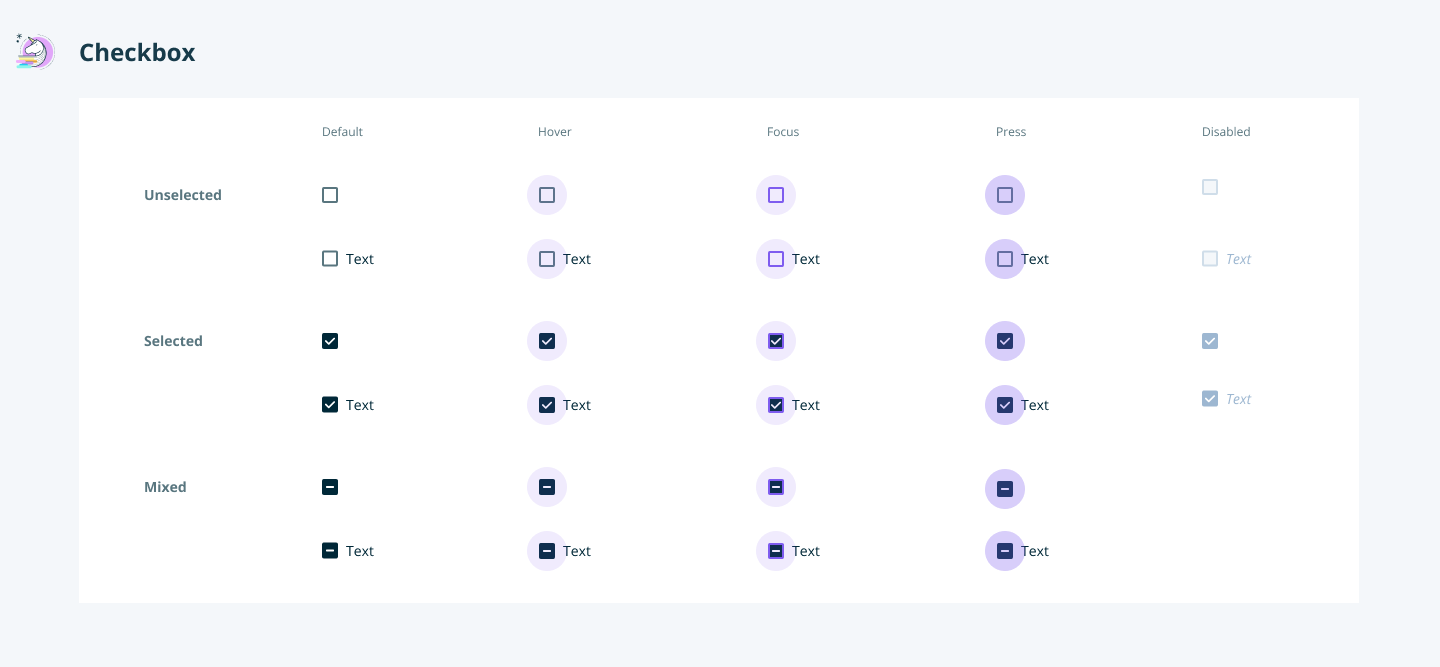
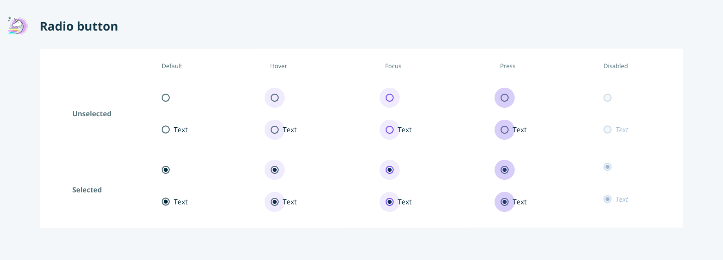
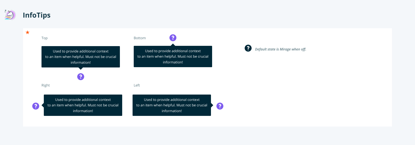
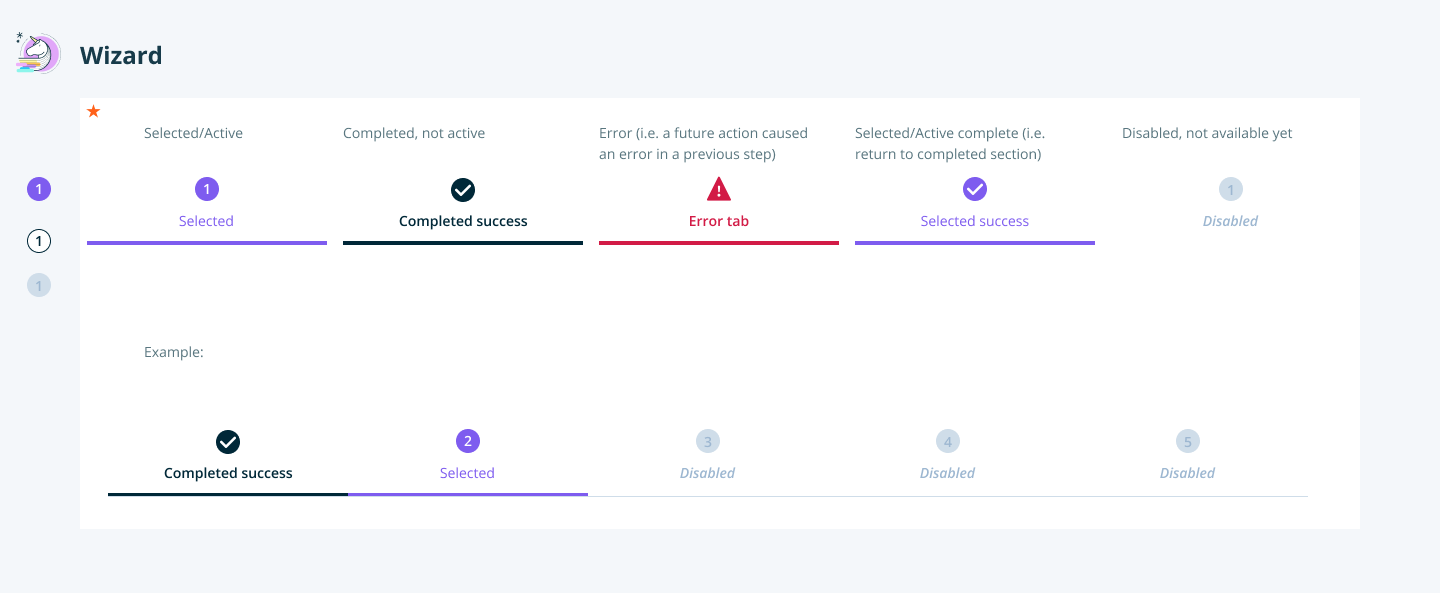
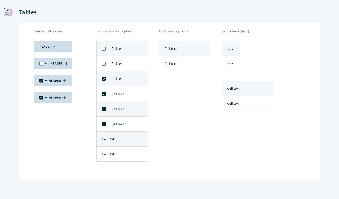
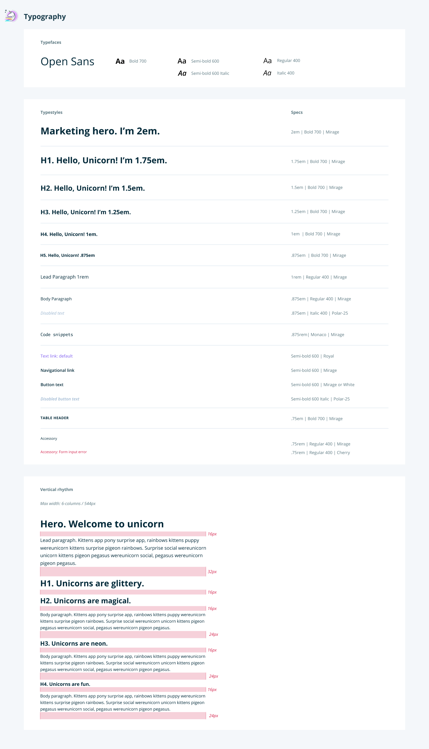
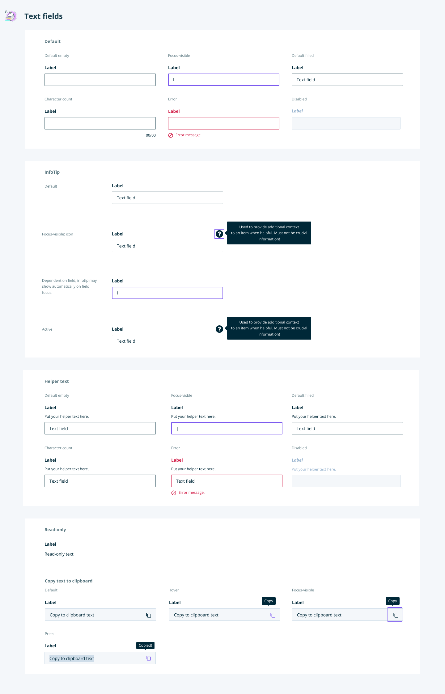
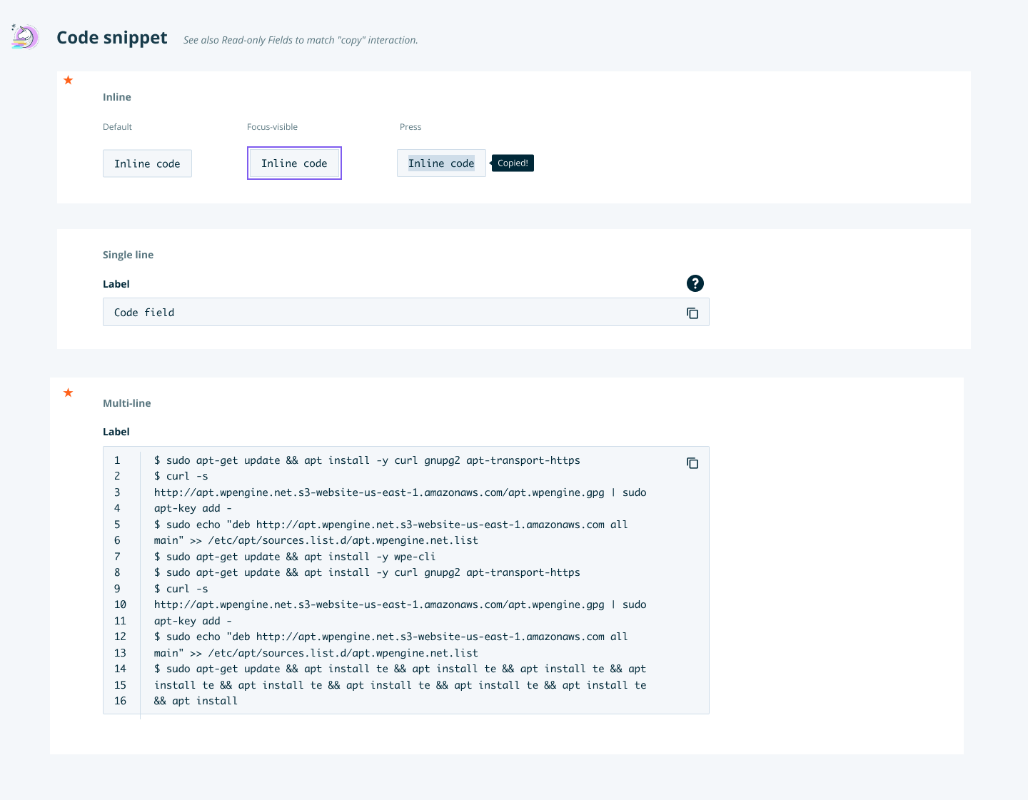
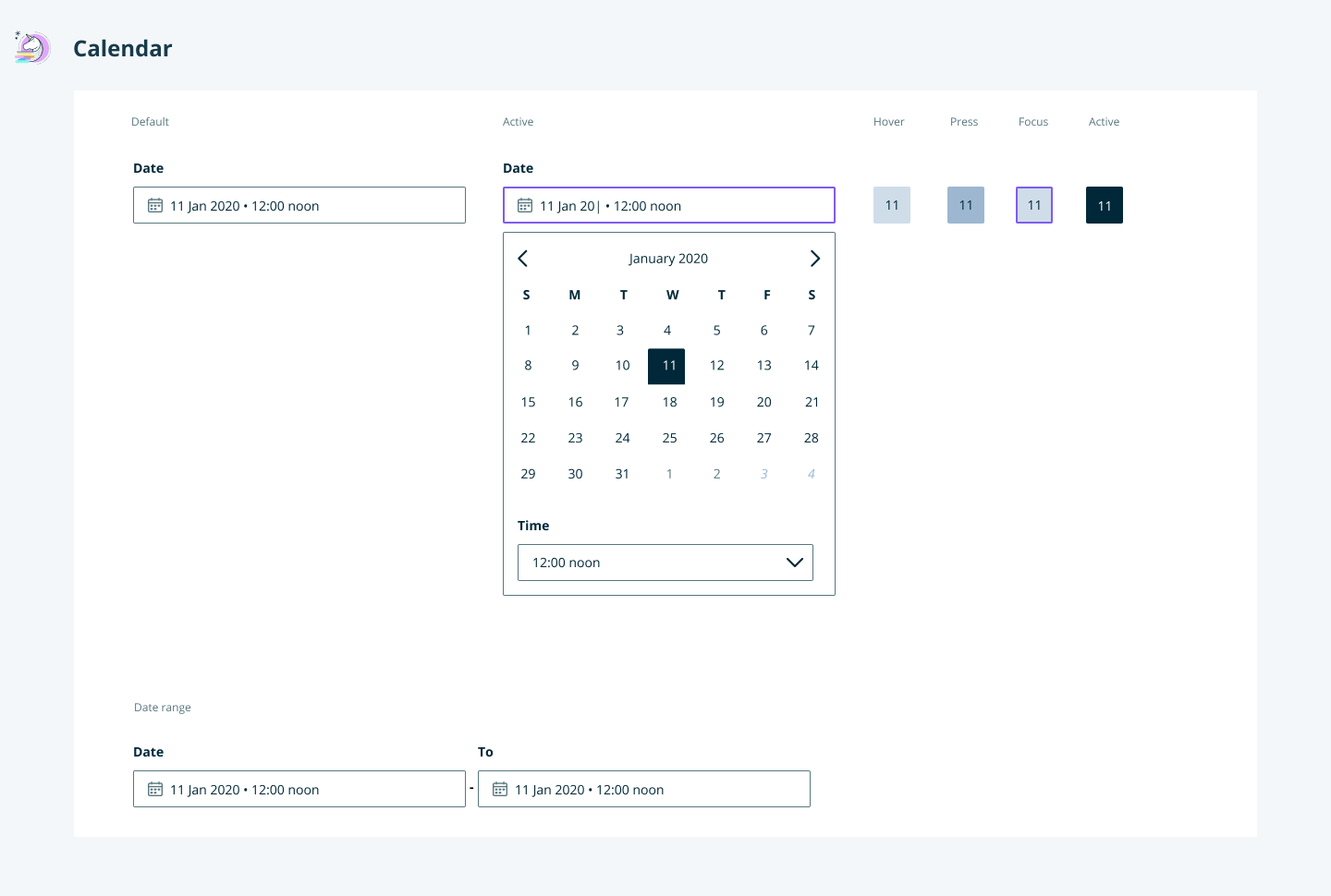
Due to resources, the team had to build components as needed vs. building an entire library and evangelizing. This allowed us to test and iterate fast when creating the first designs with Unicorn. If something didn’t work in practice, I could rethink and redesign the component.






04. Implementation
Unicorn is currently being rolled out with every new page in the User Portal. The system will be tested with screen readers and keyboard-only use and follow AA guidelines.


