1. Problems
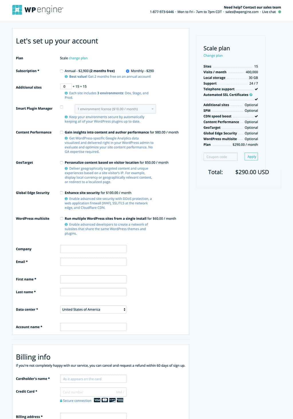
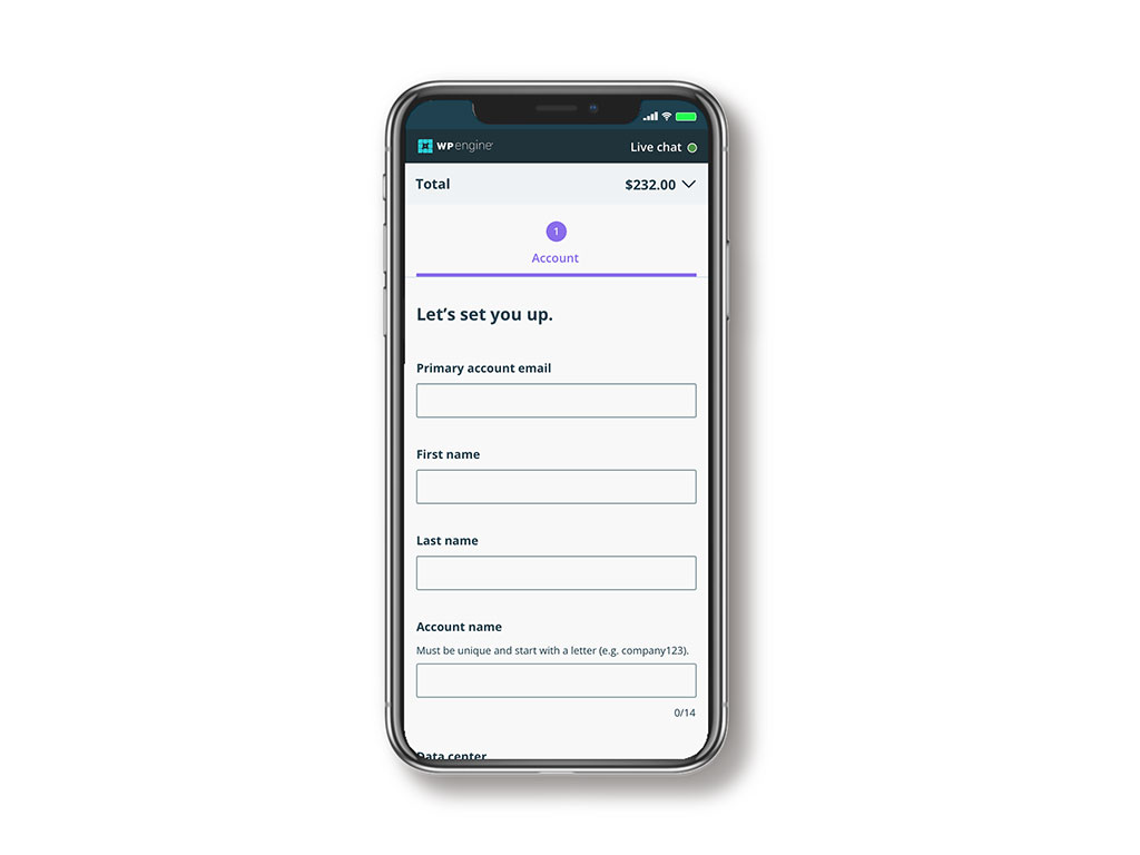
- The unassisted WP Engine sign-up flow for new users didn’t match the .com site or the User Portal. Due to its outdated UI, there was a lack of trust.
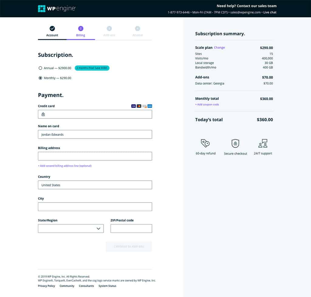
- The one page checkout was overwhelming with too many options and unnecessary fields.
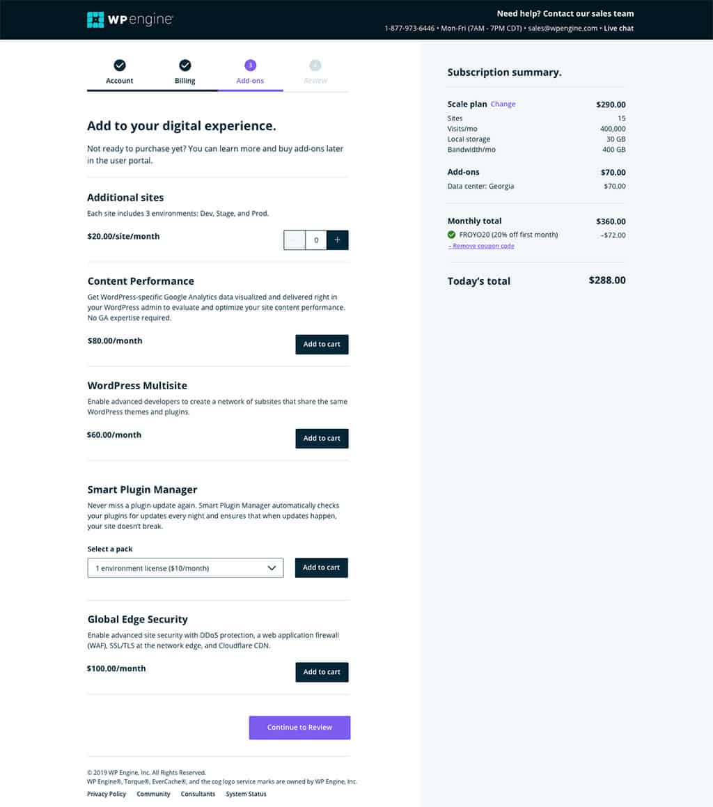
- New customers were often not ready to purchase add-ons or were not the right person to make that decision.
- With coupons, customers only got first payment off, but that was not indicated in any way.
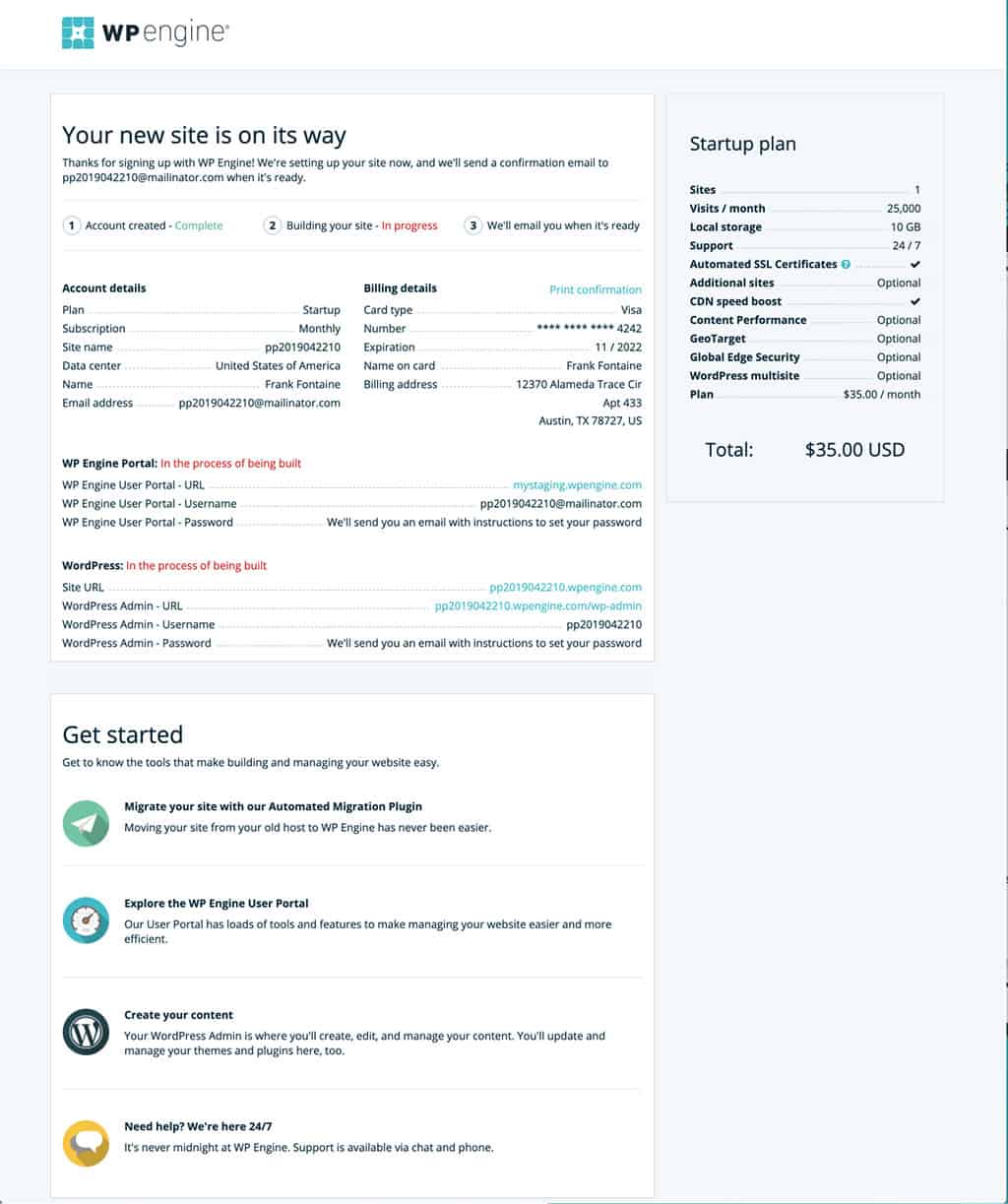
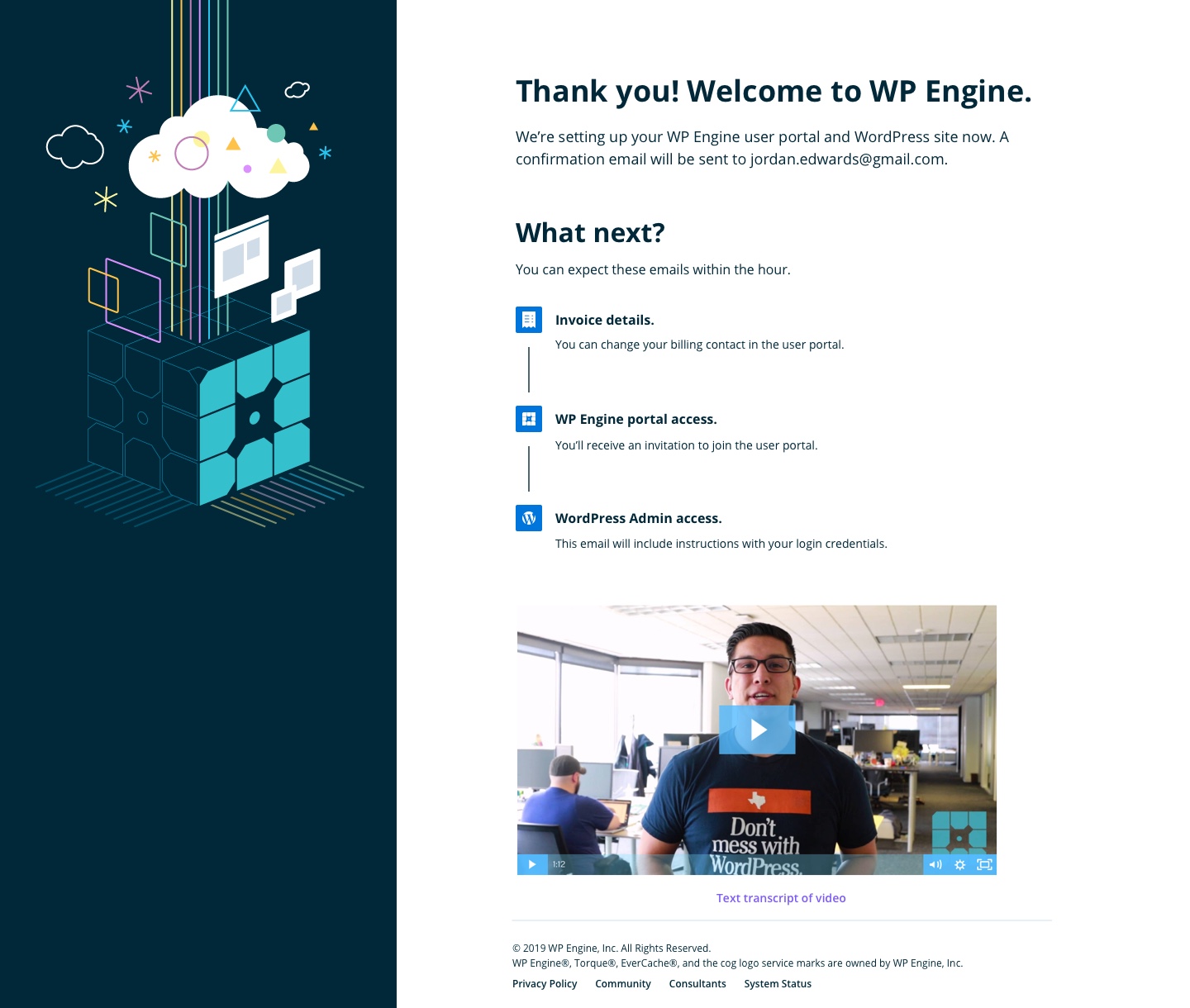
- Confirmation page was overwhelming with too much non-actionable and confusing information, leading the new customer wondering what the next steps were.
2. Pivot
Initially, the plan was to only update the UI to match the current User Portal (which is also outdated, but heading towards a new design system). Once the team looked at the project, we decided to implement the new design system and React components.
3. User flow
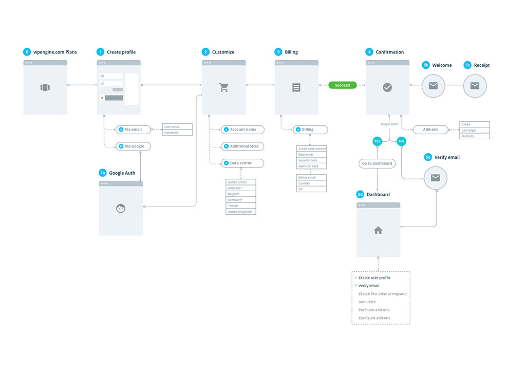
The proposed user flow was built on the future vision of implementing SSO and removing some technical confusion about how we build a site.
4. Design
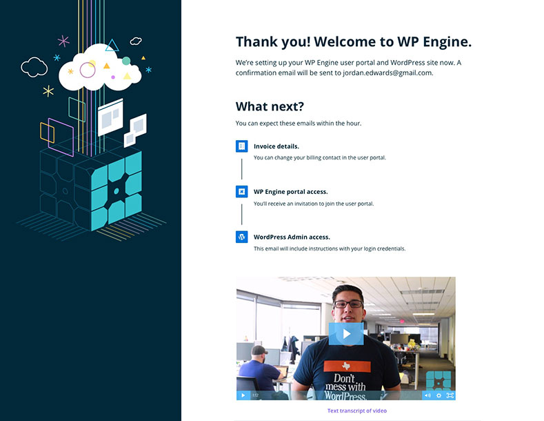
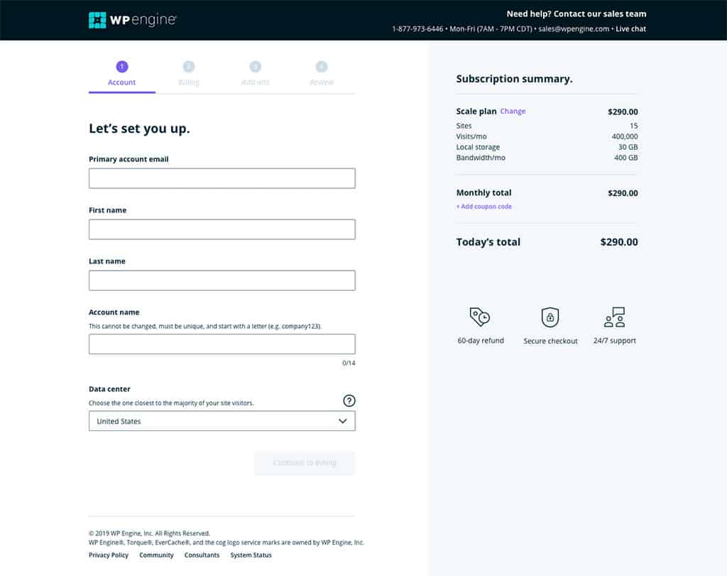
The new design uses our new design system, which also means it’s AA accessible. The experience is three tabs, and with the exception of a minimized “Address 2” and the Add-ons tab, there are only necessary fields. The confirmation page gives information about what’s happening next.
Test & iterate
Objectives
- Are participants able to successfully sign-up for WP Engine?
- What are participants initial reactions to the flows?
Methodology
Modified unmoderated RITE testing via usertesting.com with 4 iterations
Participants
- Recruited via usertesting.com.
- Current WordPress users who having purchasing power and aren’t current WPE customers.
Findings
- The redesign workflow and Unicorn patterns tested very well. Participants liked the simple and predictable workflow and that the design was clean with a modern feel. Measurements indicated an improvement over the existing workflow.
- Participants requested links to additional information about connecting to existing WP sites, why different data centers have different prices, and more information about each add-on.
- Prior to adding the review page, participants were split on whether they expected a review page before the confirmation page or not. Once added, the review page tested well and increased purchase confidence.
- They considered the confirmation page clear and appreciated the clarity of the timeline and to expect an email. Several participants said it exceeded their expectations.


