Sign-up redesign
The unassisted sign-up flow for new WP Engine customers felt disconnected from both the marketing site and the user portal. The outdated UI eroded trust before a purchase was even made.
Company: WP Engine
Role: Senior product designer
Partners: Engineering, Sales, Marketing, UX research, Product management


Problem
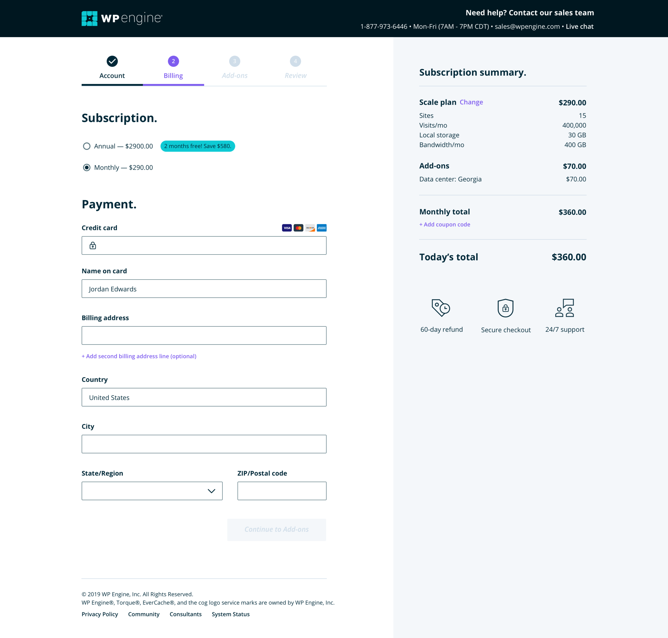
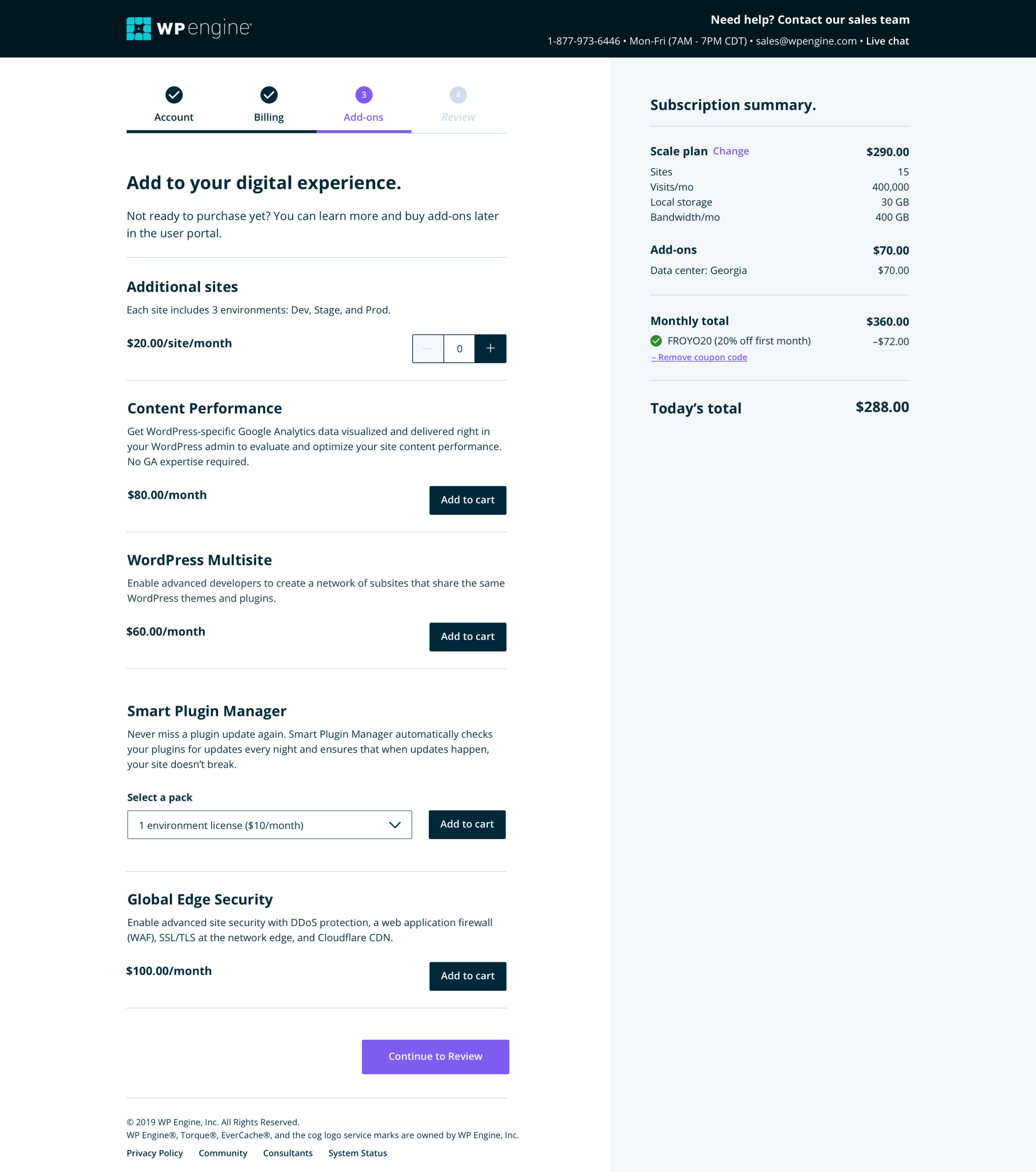
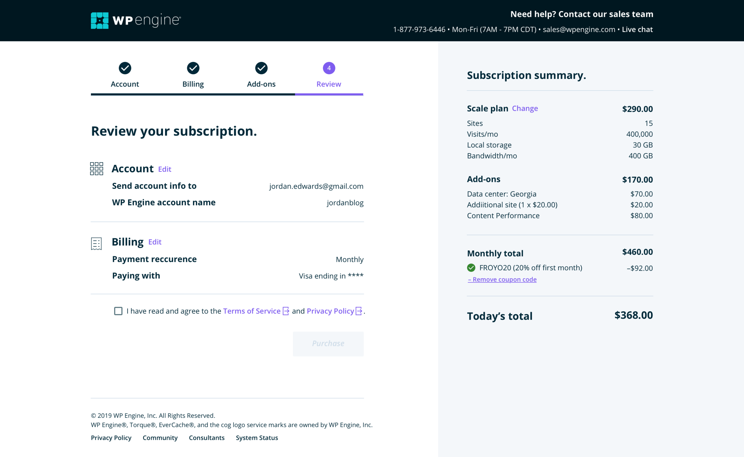
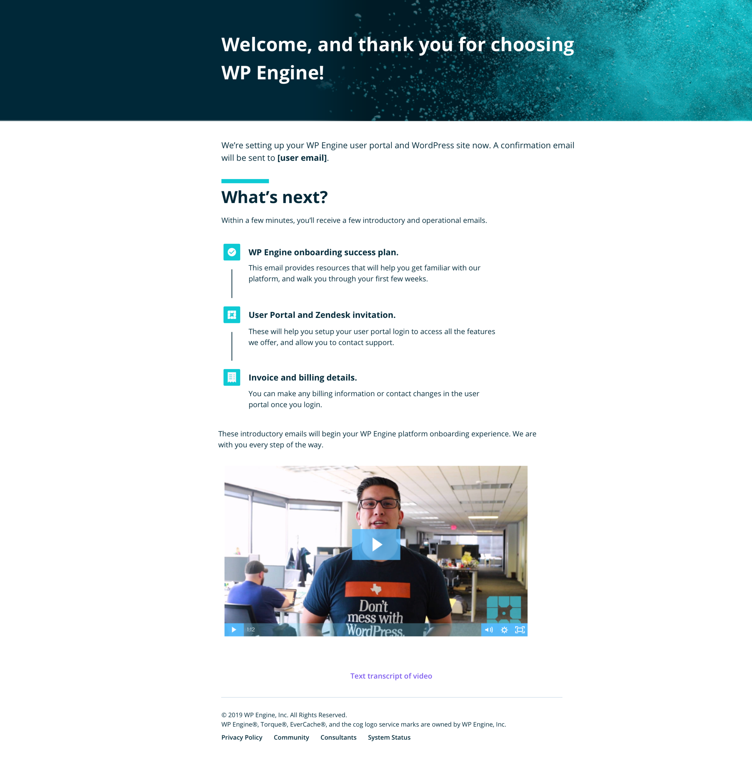
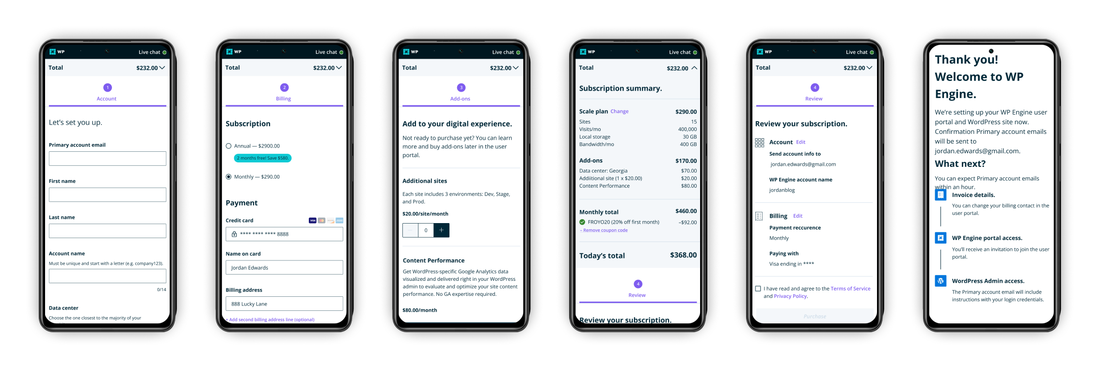
Beyond the visual inconsistency, the single-page checkout was cluttered: too many options, unnecessary fields, and add-ons surfaced at a moment when new customers weren't ready or authorized to evaluate them. Coupon discounts only applied to the first payment, but nothing in the UI communicated that. After completing the purchase, customers landed on a confirmation page so dense with information that the next steps weren't clear.
User flow
The proposed flow was designed around a future-state vision: implementing SSO and reducing technical ambiguity around how WordPress sites are built on WP Engine's infrastructure.


Design solutions
The redesign was built on:
- Updated design system, bringing the experience into AA accessibility compliance
- A four-tab structure and only kept the fields that matter
- Address 2 is collapsed by default
- Add-ons are isolated to their own tab rather than surfaced mid-checkout
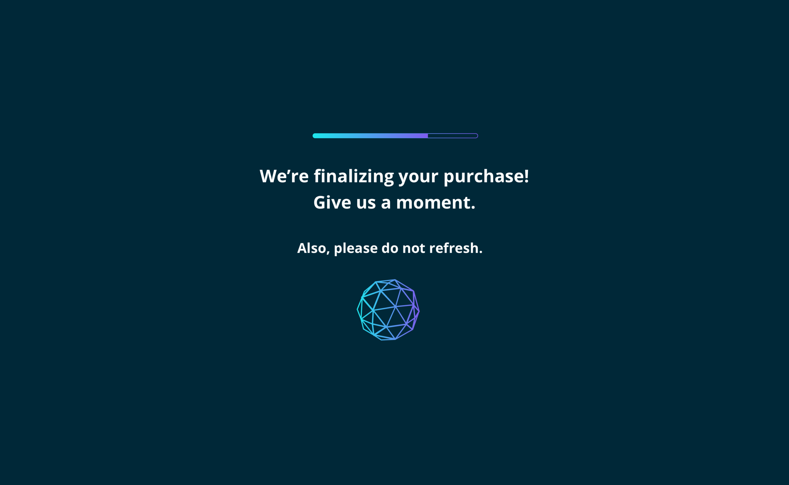
- The confirmation page was restructured around what comes next, not an info dump of what just happened
Test & iterate
Objectives
- Can participants successfully complete sign-up?
- What are their initial reactions to the new flow?
Methodology
Modified unmoderated RITE testing via UserTesting.com across four iterations.
Participants
- Recruited through UserTesting.com
- Current WordPress users with purchasing authority who were not existing WP Engine customers.
Insights
- Redesigned workflow and design patterns: Participants responded to the clean, modern UI and simplified checkout. Task performance showed measurable improvement.
- Identified gaps: more context needed on connecting existing WordPress sites, data center pricing differences, and add-on descriptions.
The review step was added mid-testing after participants were split on expecting one. Once introduced, it increased purchase confidence.
- The confirmation page: Participants appreciated the timeline and knowing to expect an email.