Inventory optimization ML platform
IOP shows supply chain teams how changing demand, safety stock, and order policies will impact inventory targets and service levels. Sophisticated machine learning analyzes inventory levels and accounting for inventory strategies. The SPA was vibe-coded in Cursor with Claude which is fast enough to land real customers, but the UX problems showed as adoption grew.
Company: LeanDNA
Role: Prinicipal Product Designer
Partners: Founder, Developer, Customer success, Product management, QA
Tools: Figma, Google AI Firebase, Whimsical


Problem
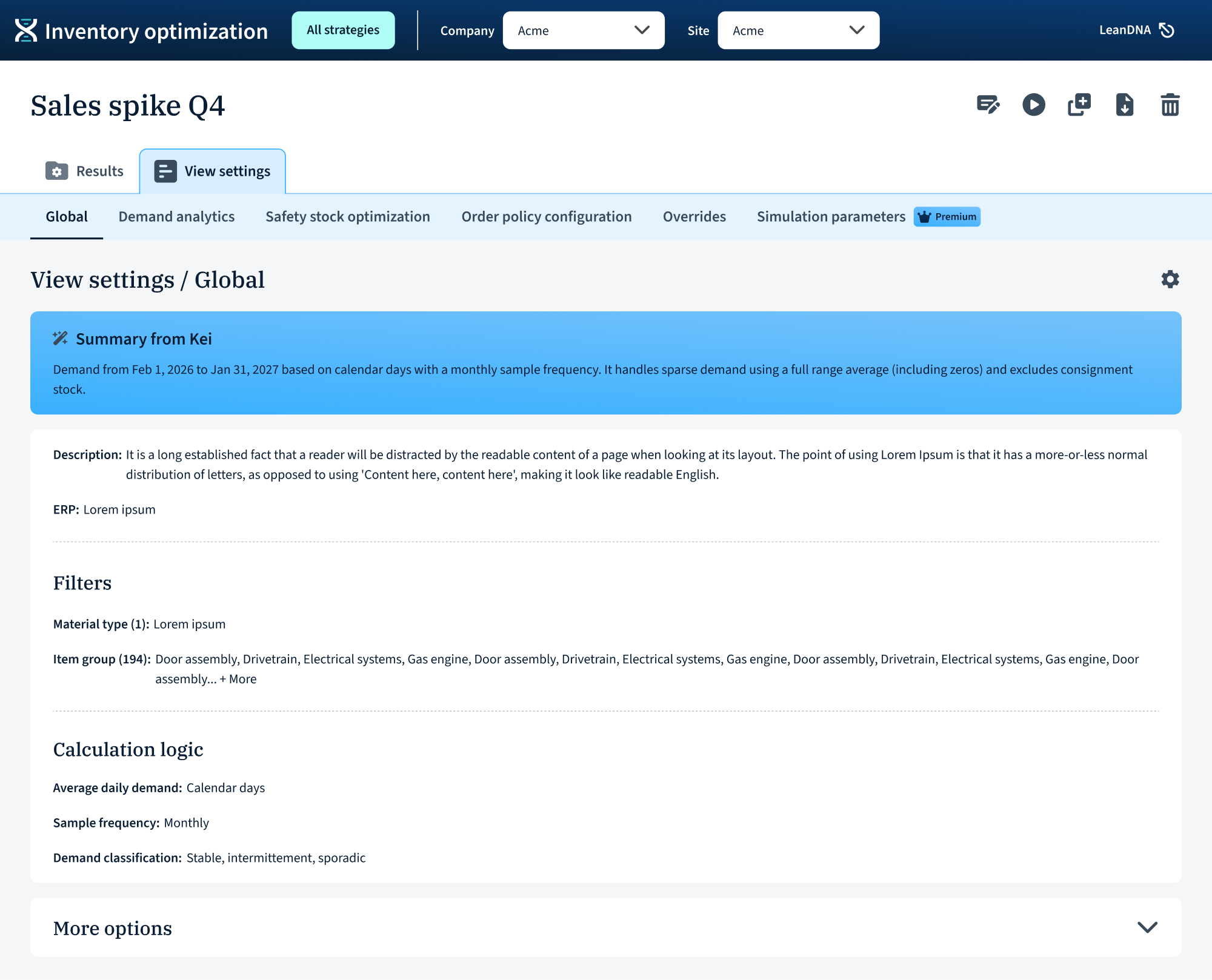
Editing settings, running a simulation, and viewing results all lived on the same screen. Users could change a parameter mid-run, see results from a previous run rendered against their current inputs, and have no way to tell which settings produced which outputs. There was also no true landing page; past simulations were buried in a table under the Simulations tab.
User research
Internal confusion
The most valuable signal was already inside the company: employees struggled, which made it hard to train users. Sales couldn't sell what they didn't understand. I shadowed Customer Success on training calls and did research calls with power users.
Insights
- Which settings made this chart? Users changed parameters mid-run and couldn't tell which settings produced which outputs.
- No home base: Customers rarely found past simulations because they were buried in a table under the Simulations tab.
- Too much: Some users adelayed adoption for months because v1 felt overwhelming.
Design

Navigation
What: Moved navigation to horizontal top bar
Why: Sidebar consumed space and was frequently overlooked
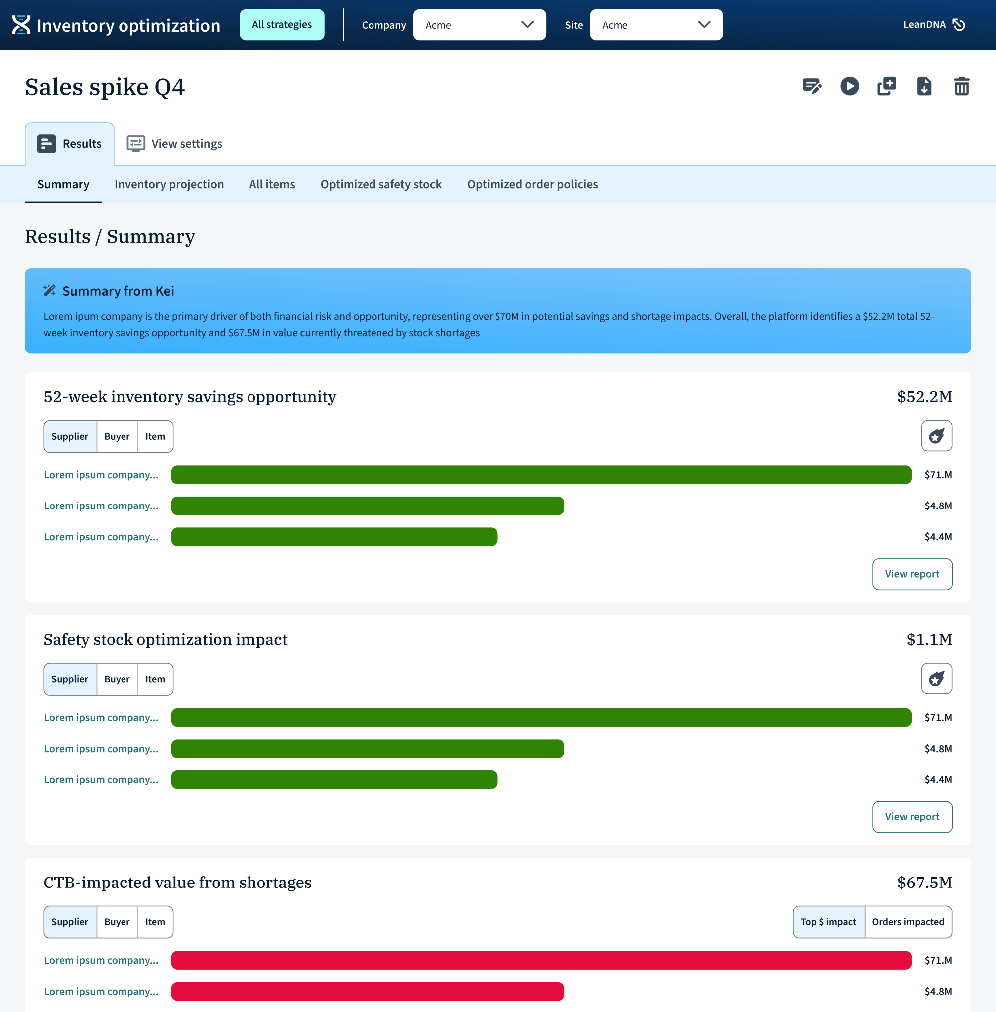
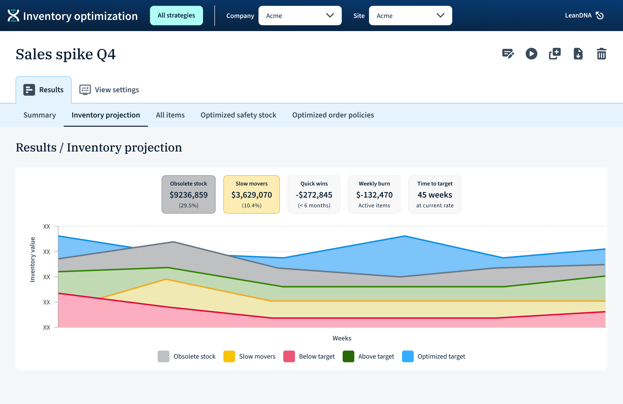
Separated modes
- What: Dedicated editing flow vs read-only results view
- Why: This was the single most important change. Users can now understand what action was taken, which scenario is running, or what scenario is being viewed.
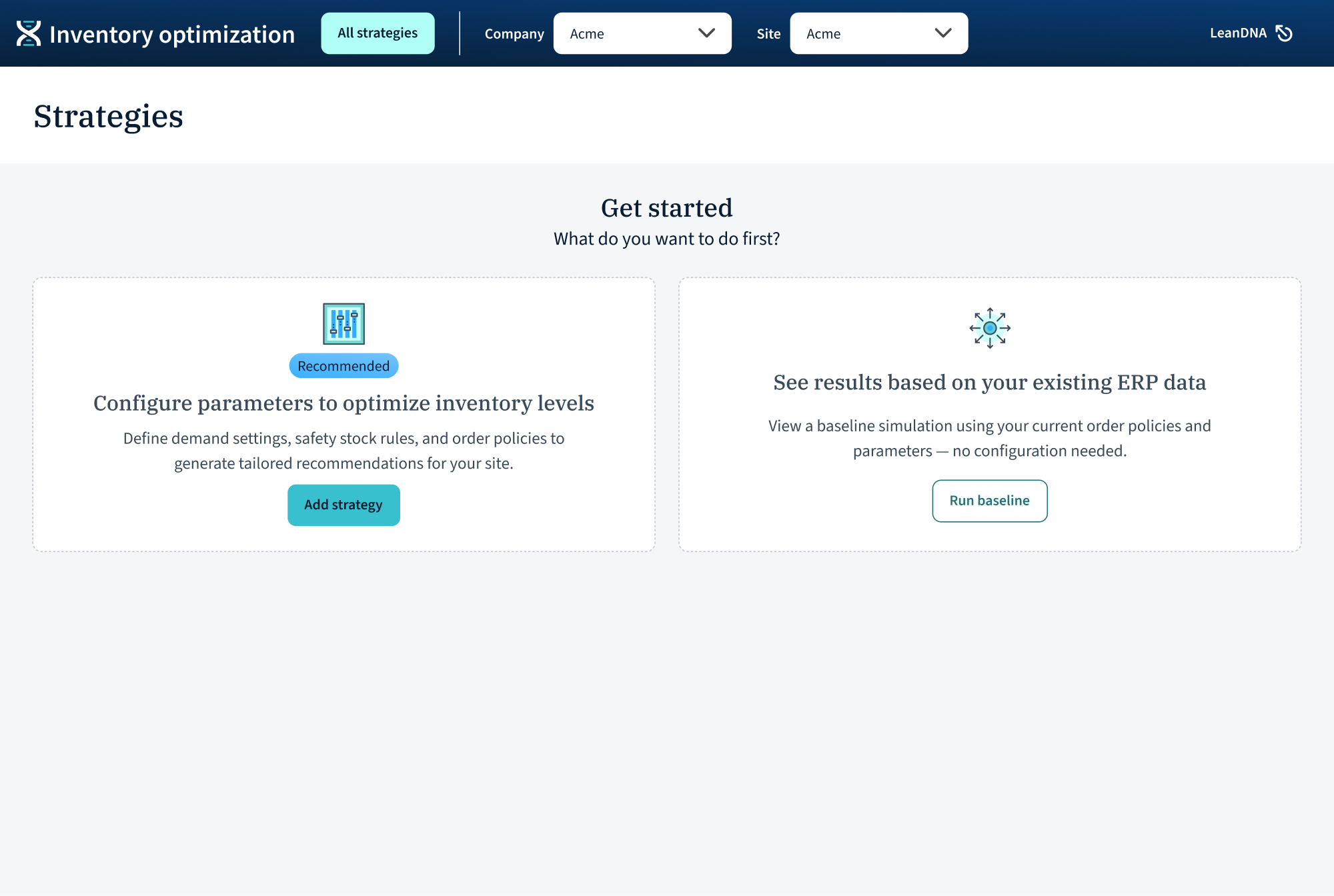
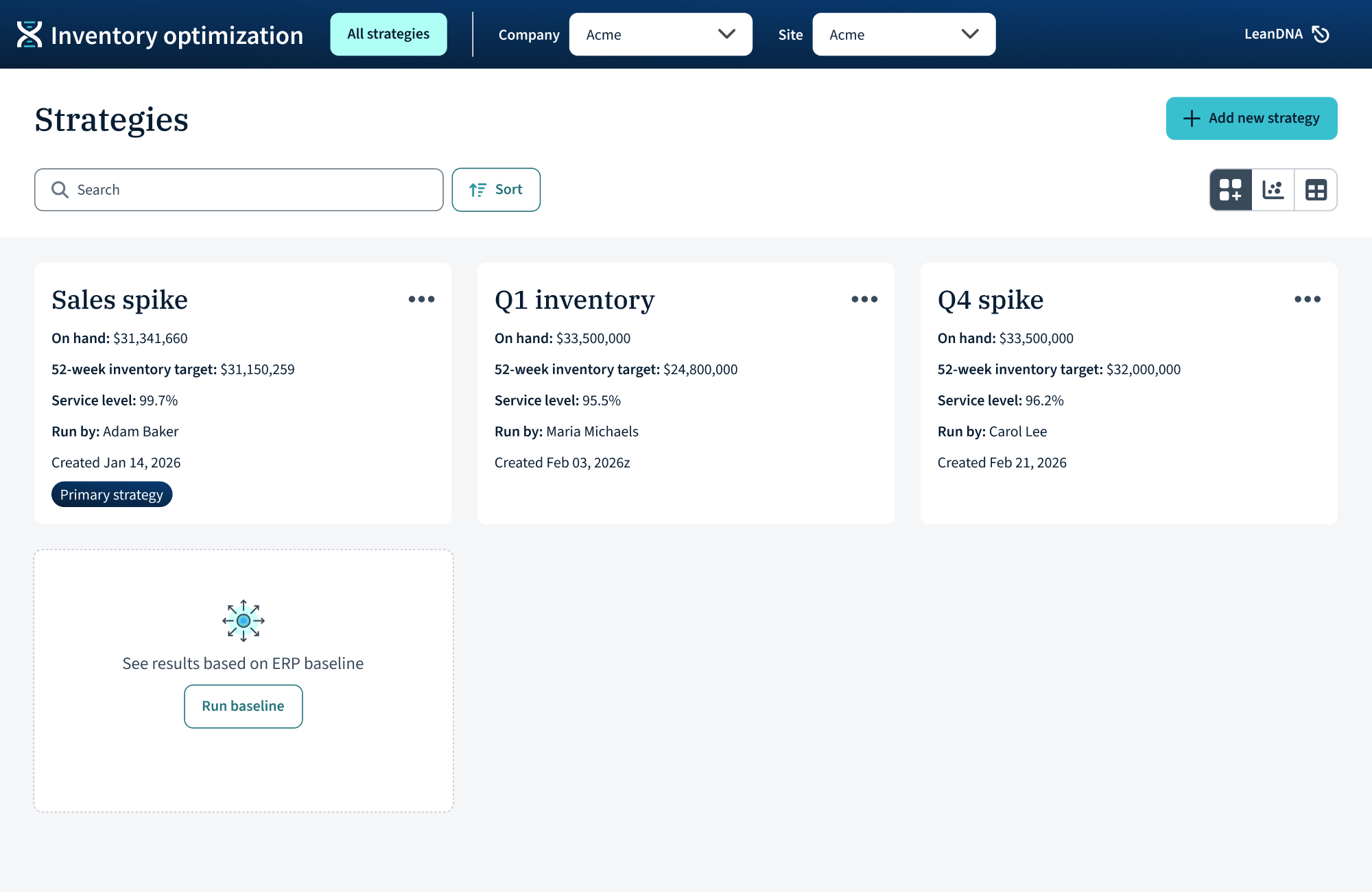
Landing page
- What: Created a real home where every scenario has a "place"
- Why: Users couldn't find past simulation runs
AI summary
- What: Kei surfaces plain-language summary
- Why: Gave users a human-readable handle on complex scenarios
Customer validation & takeaways
I tested the redesign with IOP’s highest-volume users and LeanDNA employees CSMs were delighted and excited to train with this version.
The redesign didn’t add new capability, but made the existing capability legible, which turned out to be the difference between a product users tolerated and one they were engaged in.

“I would have used it sooner if it had been like this!”
“Much more intuitive...it's obvious what's happening.”